About Circus Center
Circus Center began in 1974, when Peggy Snider and Larry Pisoni founded The Pickle Family Circus, the iconic Bay Area troupe that kicked off the circus renaissance movement in the United States. Ten years later, Pickle Family members Wendy Parkman and Judy Finelli opened the San Francisco School for Circus Arts, renamed Circus Center in 2001.
My work there
My goal at Circus Center was twofold: to reintroduce this venerable institution to a wider Bay Area audience, by representing the work of our faculty, our students, and our performers to the best of my ability.
The main goal of a graphic designer working for a non-profit should be to visually articulate the core beliefs of their mission statement. The biggest challenge in this particular case was articulating a new identity when there were so many competing views as to what Circus Center was, or what it should be. That conversation preceded me and it never seemed to come to resolve itself. So I decided to focus on what Circus Center is (or rather was, during my time there).
I forged an identity based on the building, the different disciplines being taught, and the views of the experienced circus performers around me. I also came to realize that Circus Center was more than just one of the premiere circus training schools in North America, it was also a bastion of a San Francisco that most people believe is gone. Later on, I tried to graphically convey that the past and the future don’t have to live in a linear, polarized contradiction.
I started as a graphic designer, and I later became their art director and marketing director.
It would be an impossible task for me to put together a comprehensive design brief of my work there, but here are few highlights:
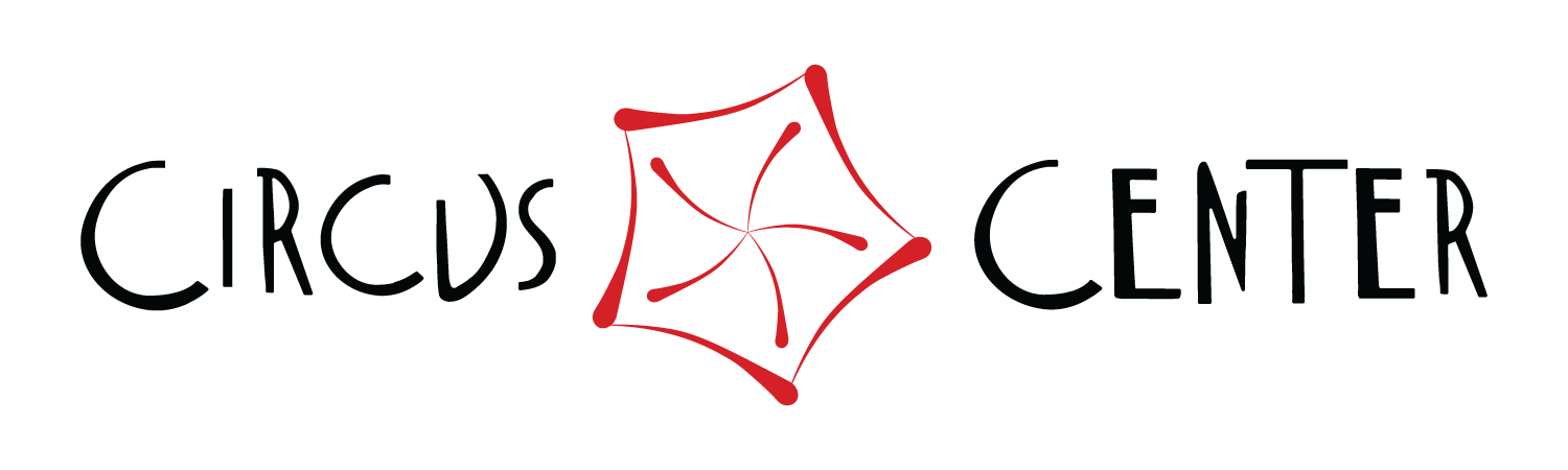
The Logo
The first thing I said during our first meeting was 'we need a new logo.'
There were some good elements in the original logo, to be fair. For starters, the circus tent seen from the top in multiple colors, conveying the notion that everyone from all backgrounds comes together to create a big circus tent is a great idea.
Nonetheless, the execution posed a few challenges: it featured too many colors, which made it difficult to place in context, the tracing was done in these thin, jagged lines that compromised legibility in smaller ratios and the irregular nature of the font made scalability a problem.
However, the logo had been designed by Master Lu Yi, the well-known acrobatics master teacher who trained a generation of outstanding circus artists and who has influenced the art form throughout North America. So folks may have had just a smidge of an emotional attachment to it.
I knew changing the logo was as likely to happen as lightning striking on an old sushi roll that's been dropped on the curb by Jay-Z after a fight with Beyoncé regarding royalty payments while on their way to a theme party named 'Night of a 1000 Liza's' hosted by Burt Bacharach and Richard Simmons on a badly lit alleyway near Hollywood and Vine at 3 am on Valentine's Day.
Yet, after years of trying, I was successful - somewhat. Not at changing it (girl please!), but at least at making it evolve.
I worked on a few variations. The goal was to keep the ideas some of the ideas from the original, but to make it more scalable, improving legibility and cleaning up the lines, without removing all of the fun - this was after all a circus school.
I created most of these letters from scratch. Then I reworked the text, giving it simpler curves and tried to make the tent and the lettering look similar in style.
The original logo

The first change I made was removing the color are changing the layout
The second change was to clean the lines as much as possible

This is the latest version of the logo I worked on.
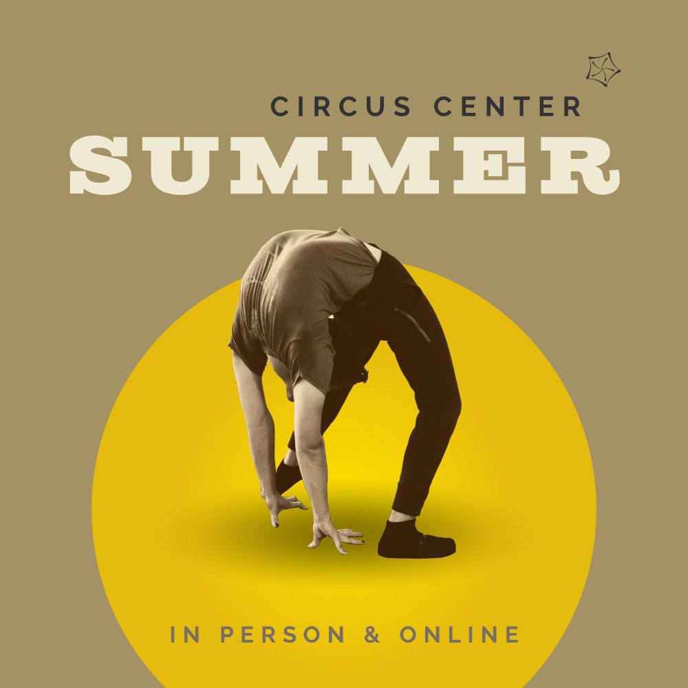
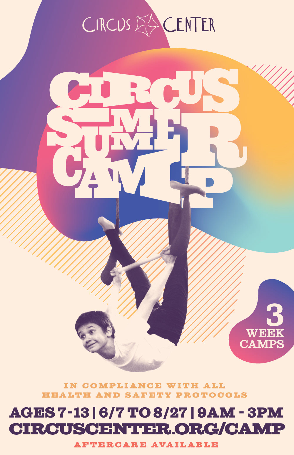
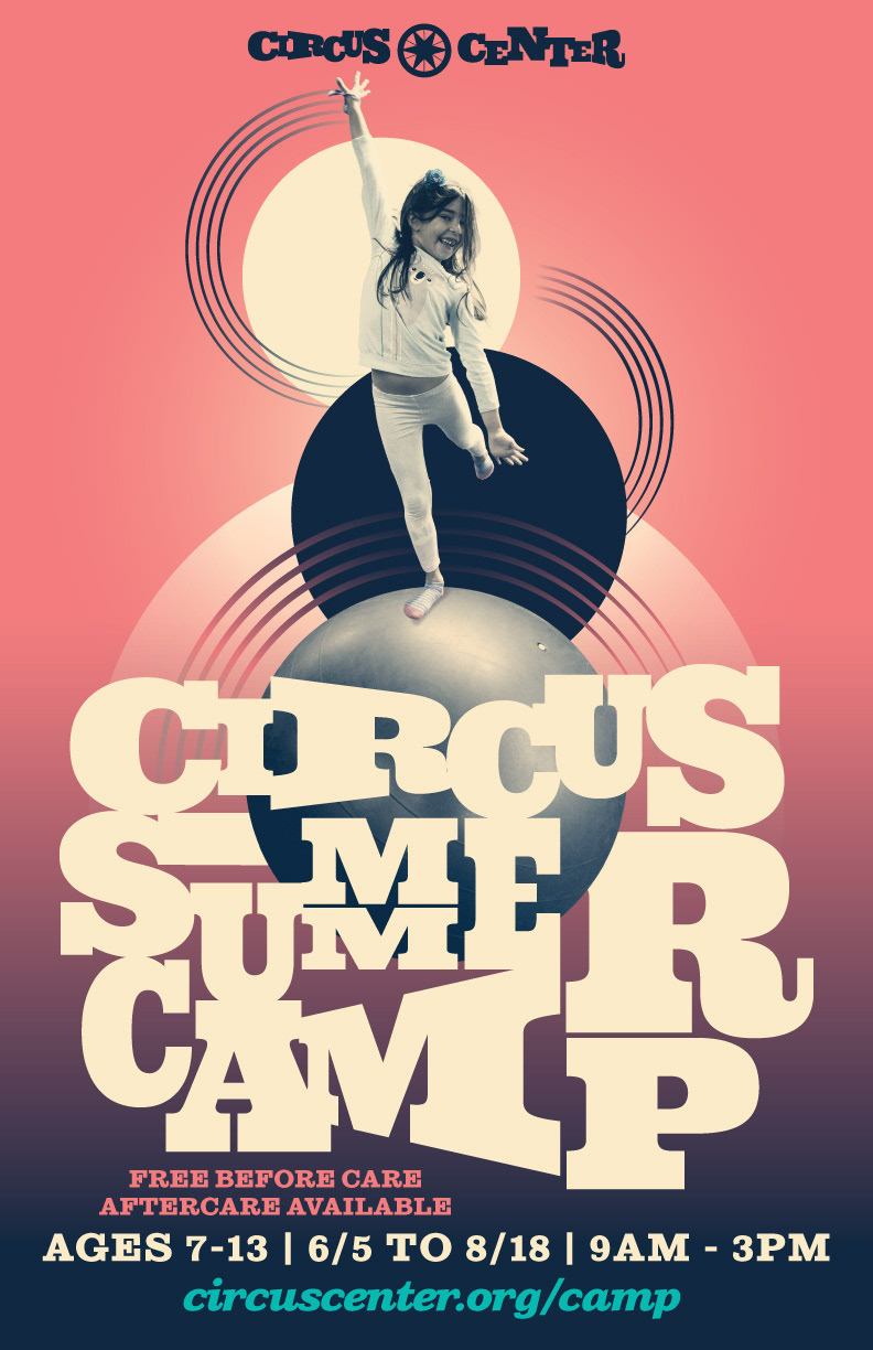
Case Study: Circus Summer Camp
The Logo
Summer Camp was one of our biggest programs. Particularly once the force of nature known as Texas Holly became its director. She kept Camp going even throughout the pandemic.
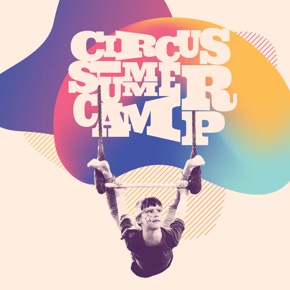
By 2021, it was clear to me that our camps needed a more identifiable look. Something that would speak to the fun and the collaborative nature that Texas brought to them.
The typeface I used was , because of its high legibility, retro vibe, and because it had a bit of a circus feel to it.
The concept behind the logo was based on all of the human pyramids I had seen kids do at camp. And so, keeping with Lu Yi's idea, this was about different kids, with different stories, and from different backgrounds coming together to create circus.
This version of the Circus Center logo at the top is refashioned to fit the style of the camp logo, but it still takes a few cues from the original.


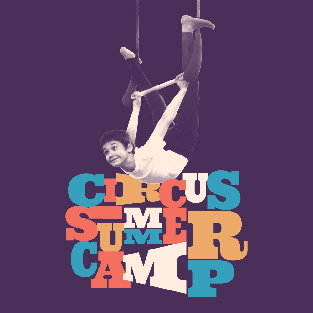
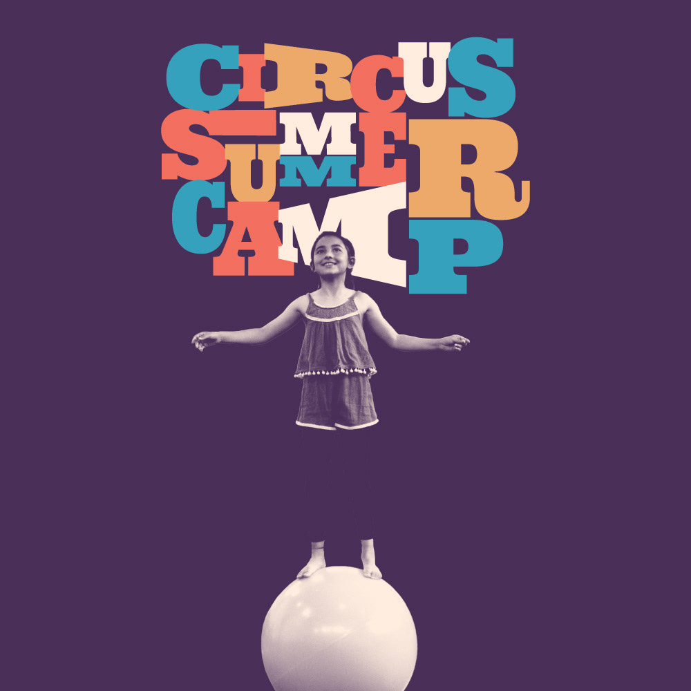
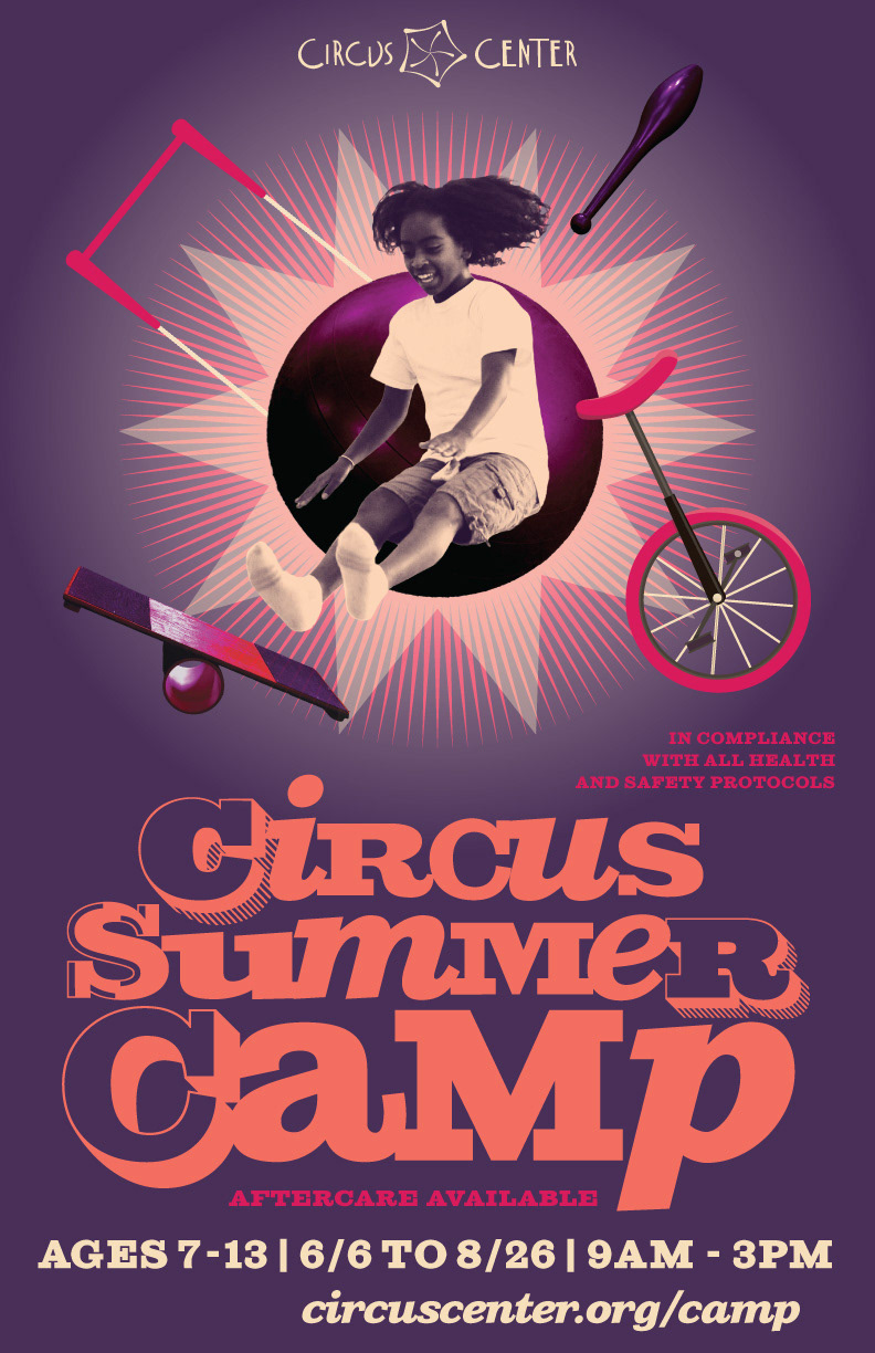
Summer Camp 2021
For our 2021 Summer Camp, I decided to go for a design that would have a retro feel, something that connoted San Francisco back in the day, with a color palette that would be more representative of our city today.
The idea was to say 'that San Francisco we keep reminiscing about is still alive within our walls.' I could say that with confidence because Texas Holly was the one in charge and I knew her heart.
We were a team, and this design is also a visual representation of her personality as well.
Marketing
Camp became my first on-the-ground learning process for understanding marketing.
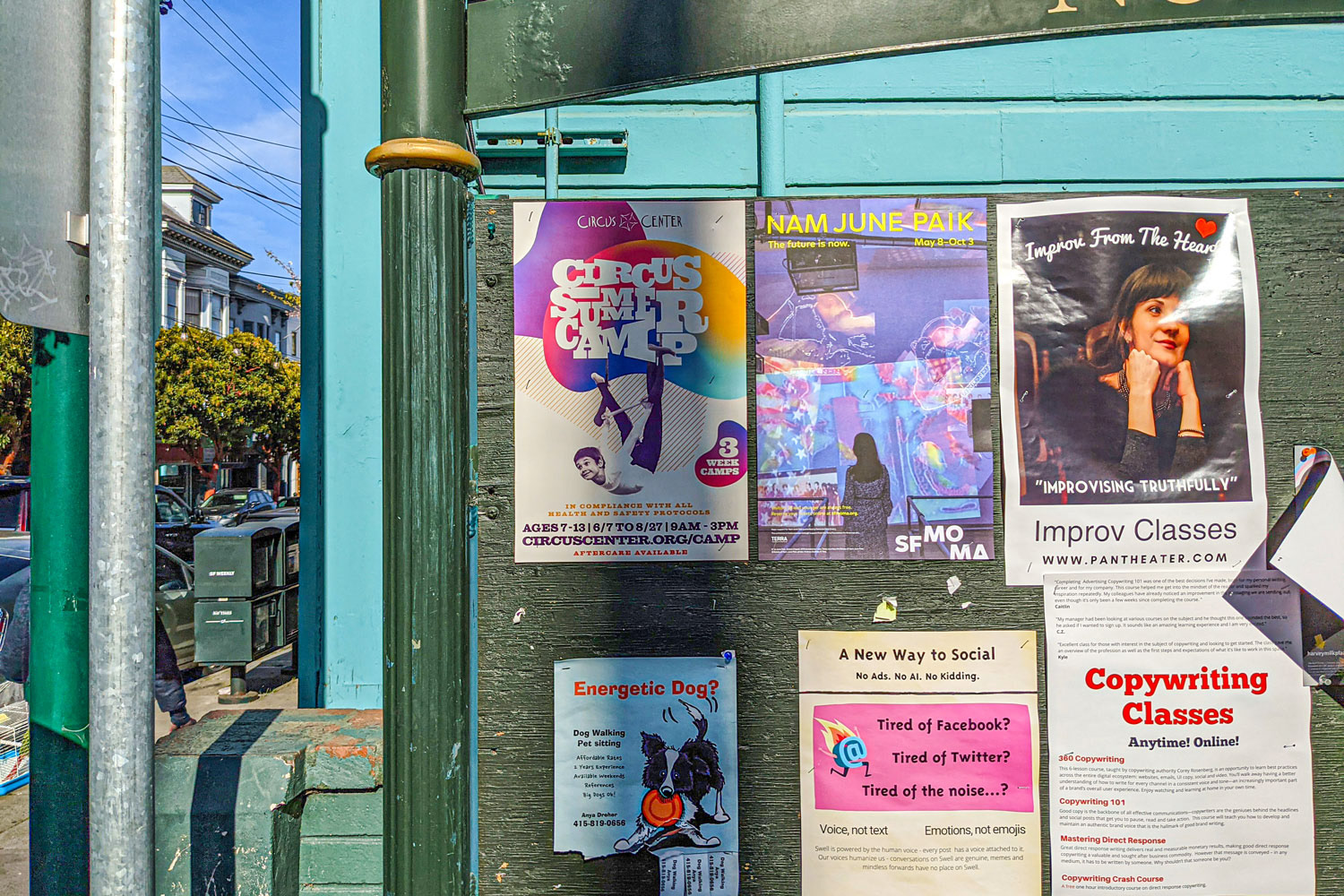
I became aware of the importance of timing, and how all the pieces came together. The main poster needed be ready on January 2, which was when registration needed to start. The real marketing push always started a little later, right after the initial rush of interest, intensified by the early bird discount. I had our posters ready for distribution a couple of weeks later and they needed to be dispersed all over the Bay Area before the end of January.
I kept track of registration. I designed postcards, social media ads, and social media posts, the camp t-shirt, the website and the emails, which had become our greatest marketing tool.
Registration grew stronger every year, and camp would fill up earlier as well. As soon as March rolled along, our high registration numbers became their own marketing tool. By 2023, we sold out all 440 camp spots before camp even began.
Social Media Campaign
Standing out & scrolling down
That very first second of interaction with potential audiences is crucial. Graphic design plays a big role in telling folks that we know who we are, and we know why we do what we do. That is, in my opinion, the subtext of our work. On the left, we have one of our posters in the wild. On the right, an example of one of our email campaigns, which had become our greatest marketing tool. I always remove backgrounds and keep emails as stylistically even as possible. In my experience, it allows for the eye to look glide down without any visual stops, which allows for a more fluid scrolling. The click rates at the very bottom of our emails seemed to confirm that.
A special shoutout to Gabriel Galdamez, who became our marketing director at the height of the pandemic. His invaluable insight gave us the framework we needed to keep classes going during that challenging time. And it set up the basics of our marketing during our reopening process and beyond.

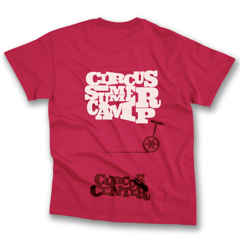
The Summer Camp T-shirt
For every week of camp they sign up for, every kid gets their own t-shirt. So we typically order more than 400 t-shirts a year.
Working on them always meant spending some extra time coming up with a design that would appeal to our youth. Our Camp marketing is mostly geared towards parents, but this must be literally tailored to them. If they don't like it, they won't wear it.
Based on Texas' feedback, we decided to ditch our current color palette and stick with a bright red. It was the right choice. Everyone wanted one.
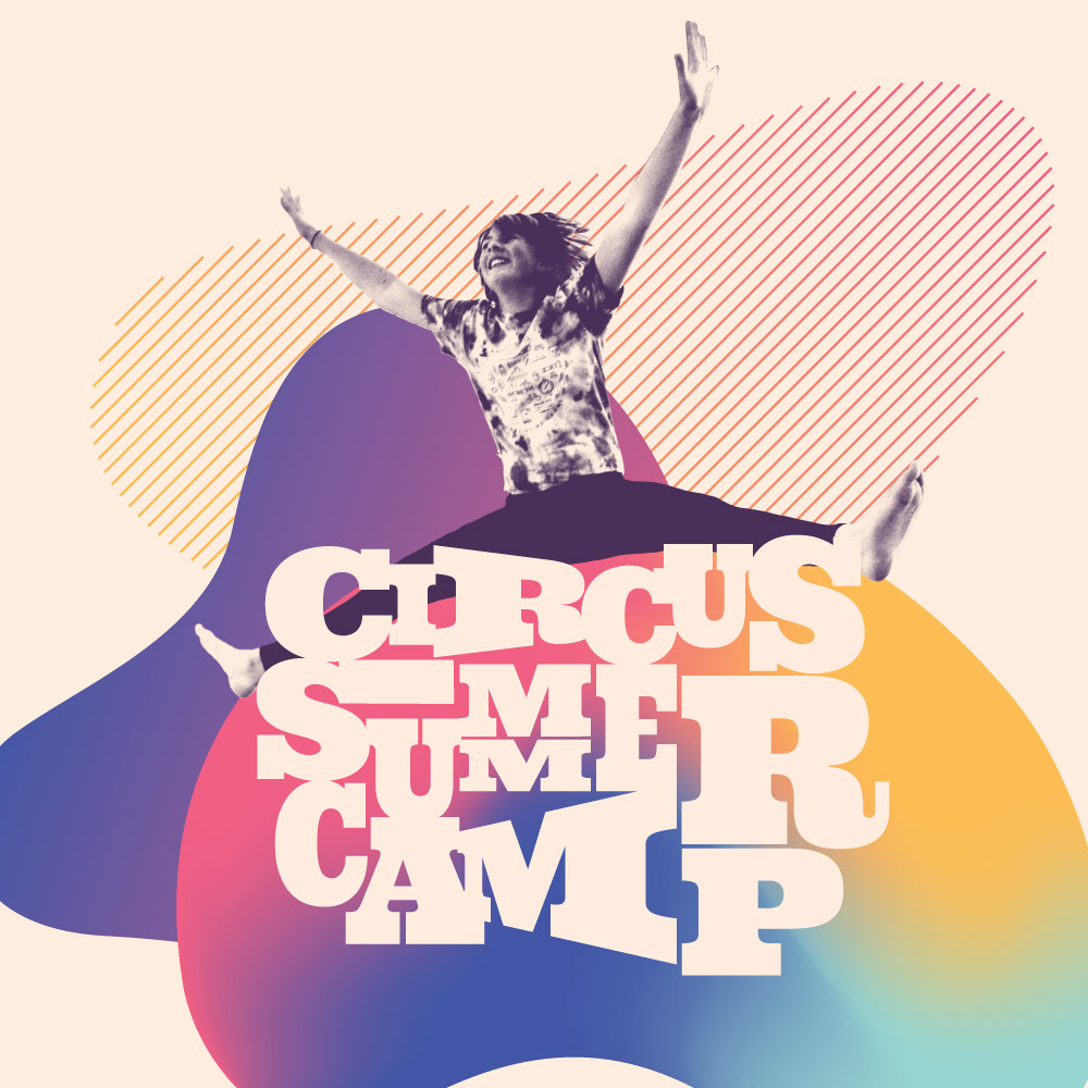
Other Camp designs
Yes, side by side, and even on their own, these may look like an attack on the senses, but on the street, or while scrolling, these designs need to compete for attention with everything around them - not to mention other summer camps. Our click rates were always higher than average, both on our social media ads, as well as in our Google Ads campaigns.

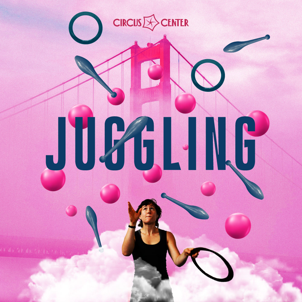
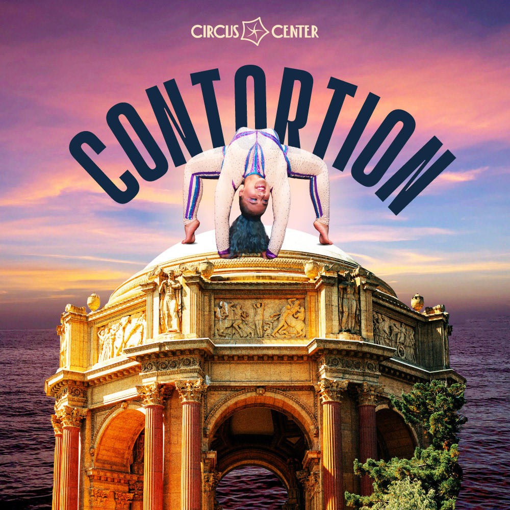
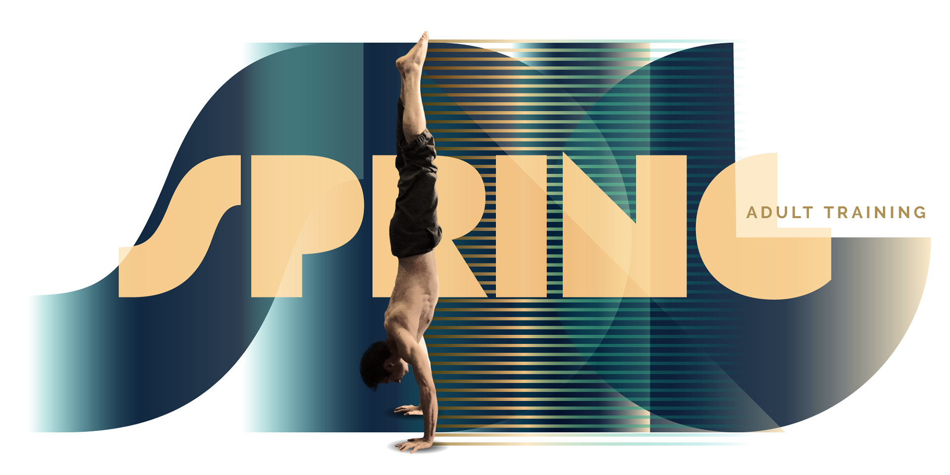
Adult & Youth Training
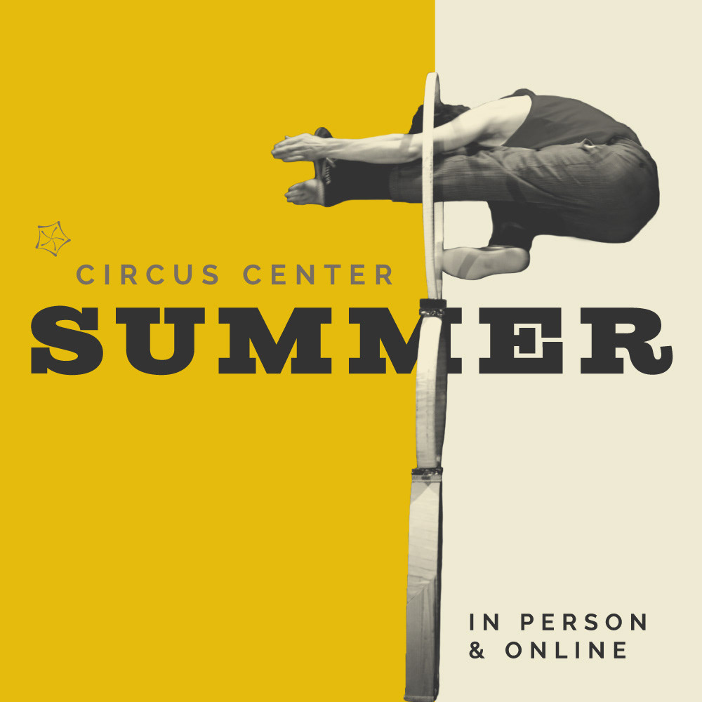
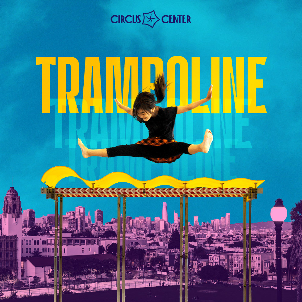
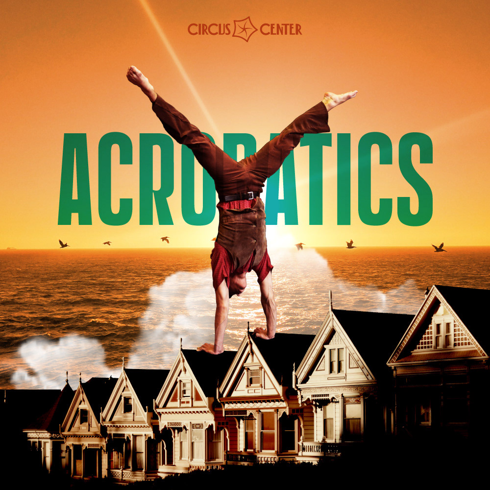
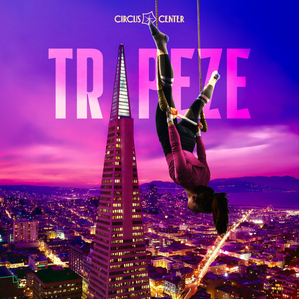
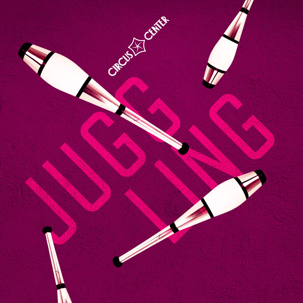
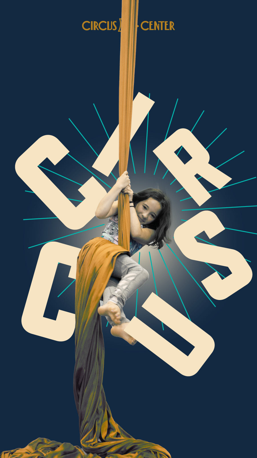
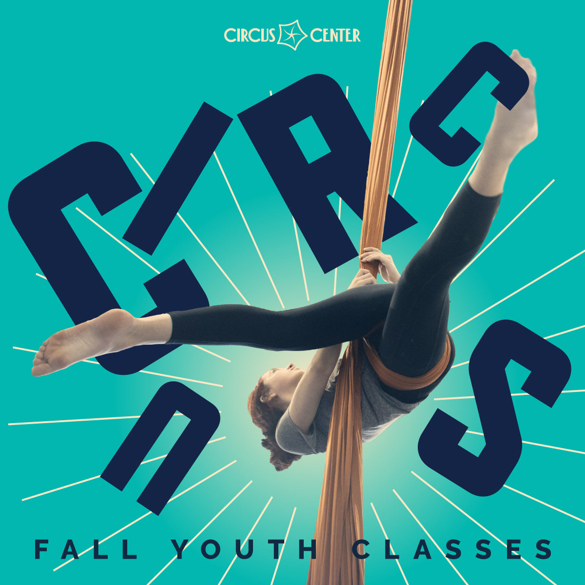
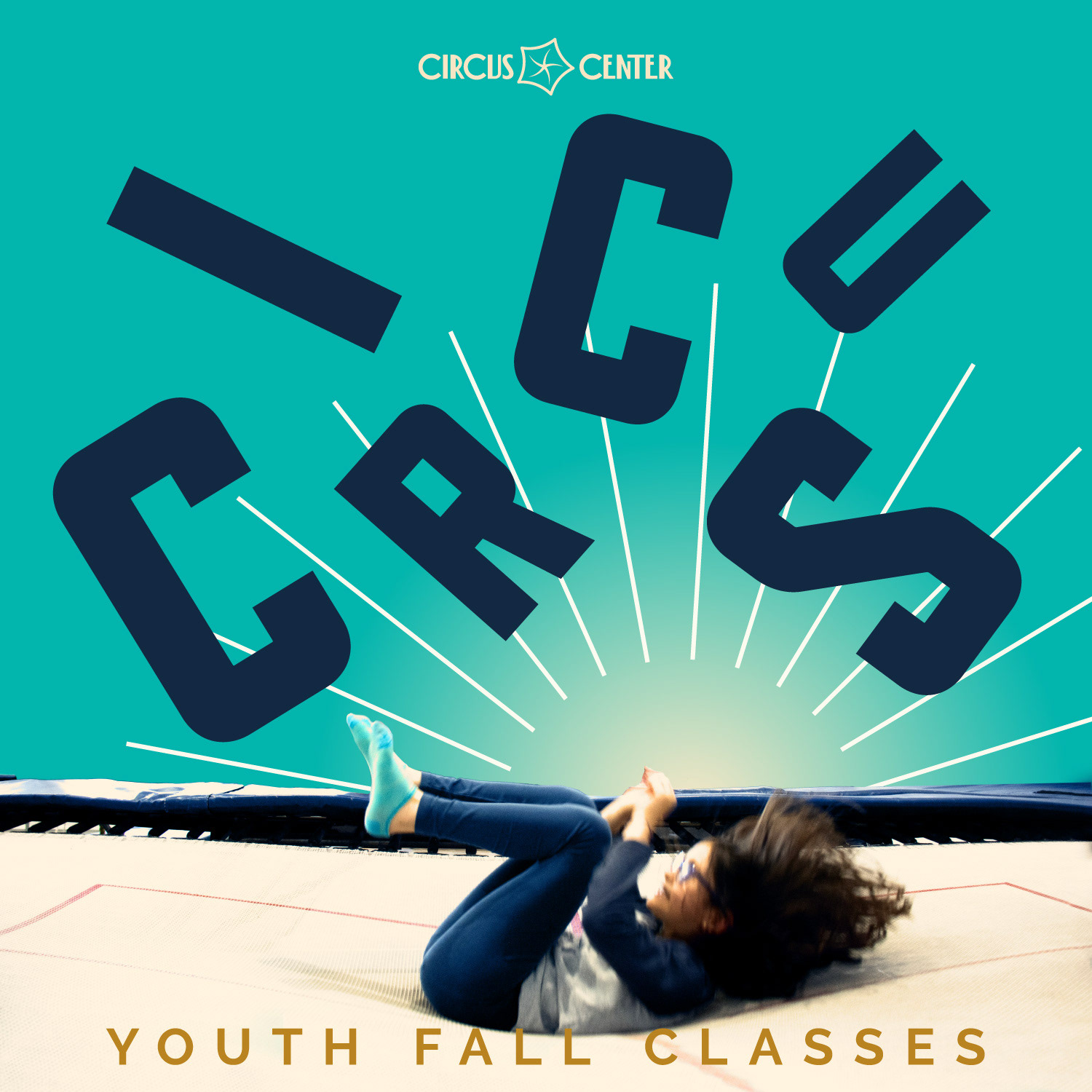
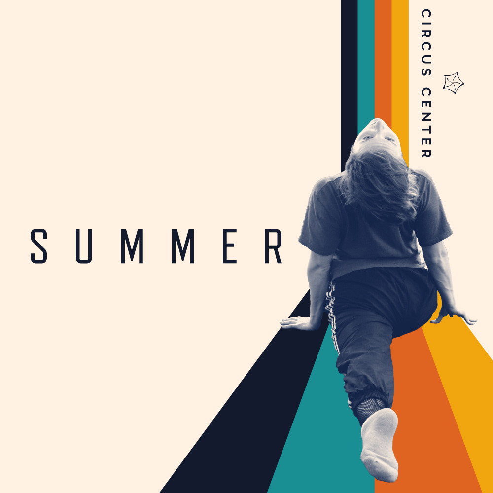
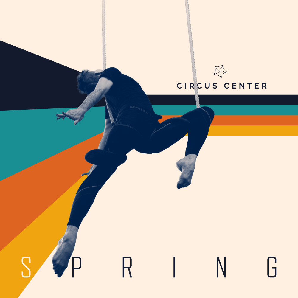
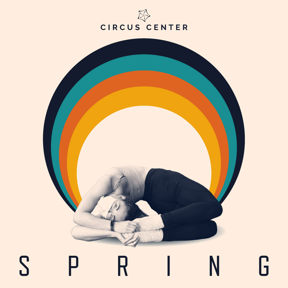
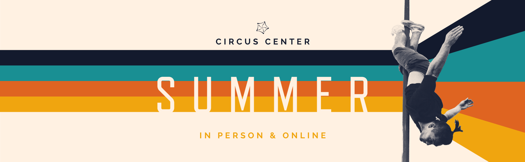
The constant variables in our identity have been our fonts. Everything else evolved. For our title font, I picked Refrigerator Deluxe: with its combination of high legibility and narrow design, it was ideal for titles that need to interact with the angles and curves created by circus performers. It features a vintage feel, combined with a certain tone of severity, which worked well for the Circus Center building and the highly demanding art form we were promoting.
We did change our title typeface to Sutro during the pandemic, with its friendlier, round curves. But we went back to Refrigerator Deluxe once we fully reopened. Our paragraph font has always been Raleway (I picked it right before it became so popular! I swear).
Regarding style, I was aware that I was promoting the work of artists who are constantly pushing the boundaries of our physical abilities. My designs needed to look enticing to the prospective student, while also showcasing the drama. We were not a gym. We were a circus arts school.
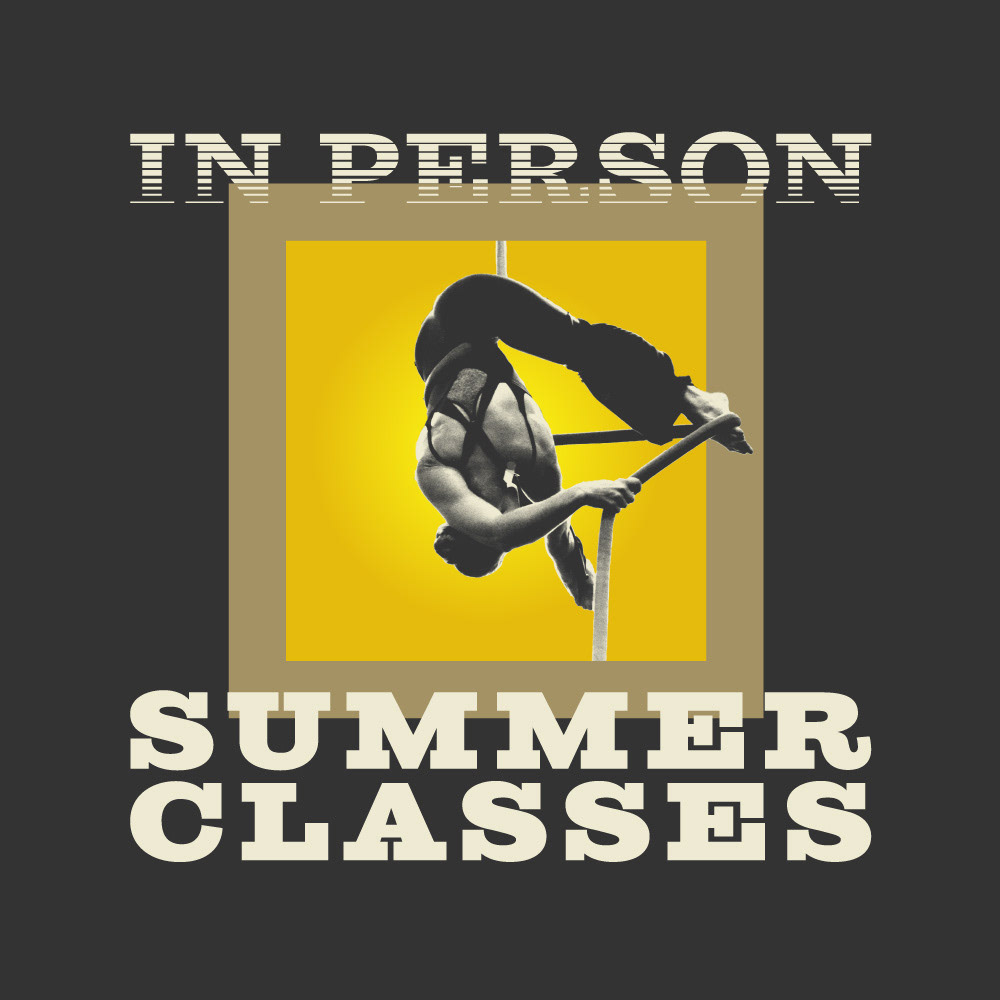
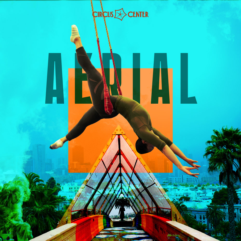
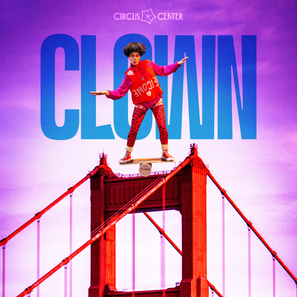
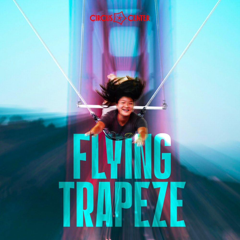
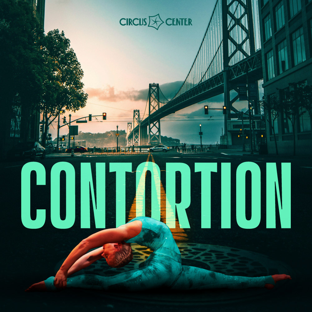
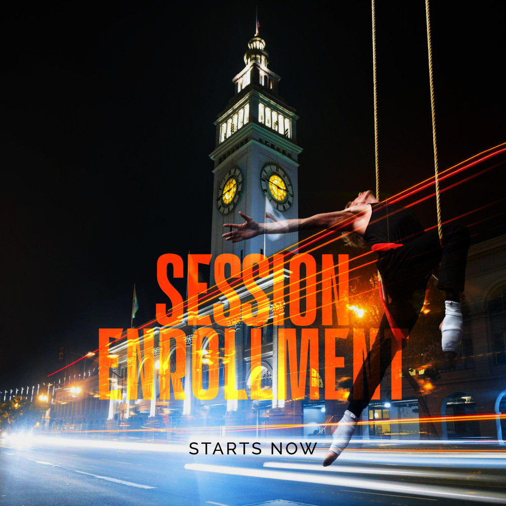
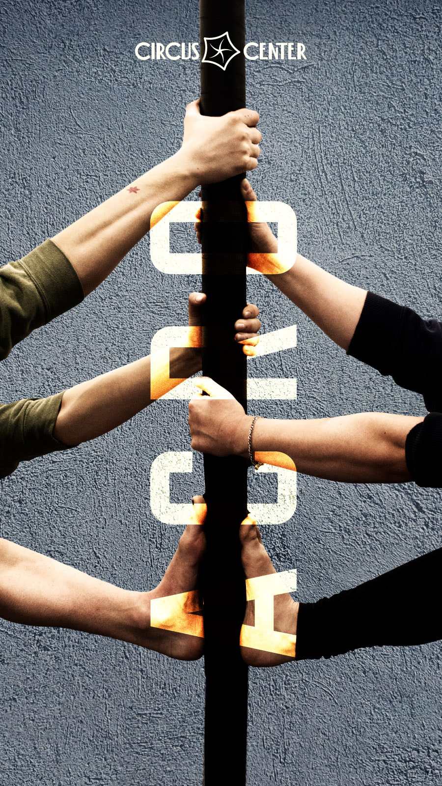
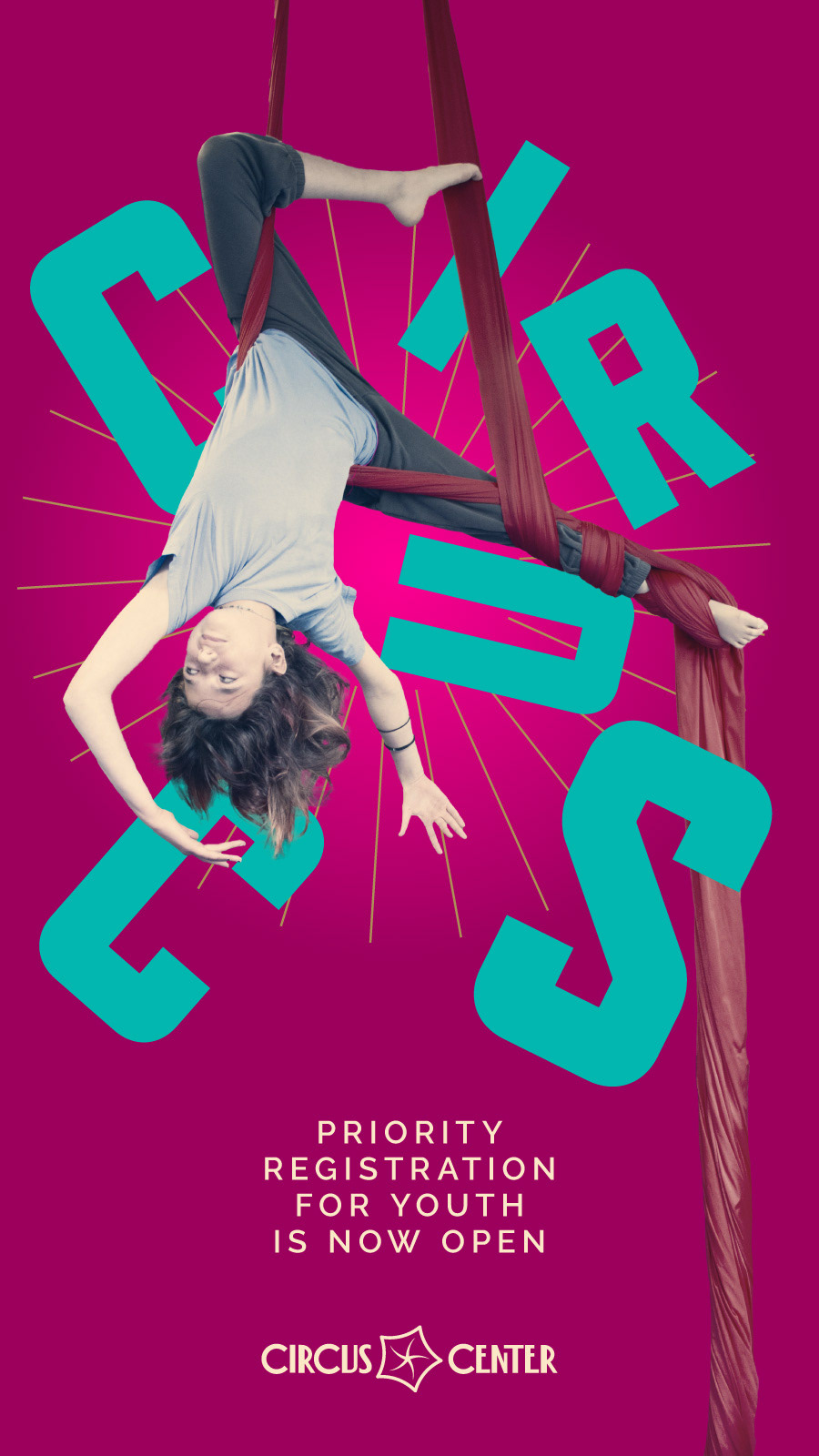
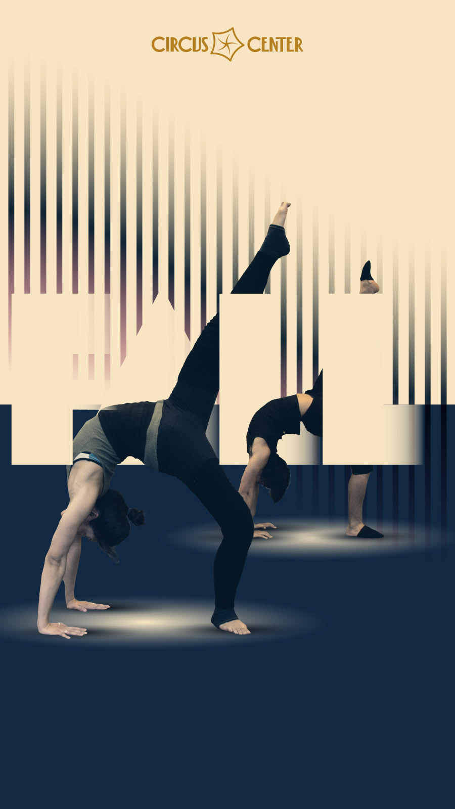
Summer 2025
In the spring of 2024, I was laid off from Circus Center. In the Summer of 2025, I was rehired. I won't go into that, but I will say that the events that took place during my absence made it clear that I needed to come up with a campaign that would show that we hard turned the page, and that we were here to stay. Which is why the city of San Francisco becoming central to every design. This term, which marked my return to Circus Center, features a different title font: DAMN.
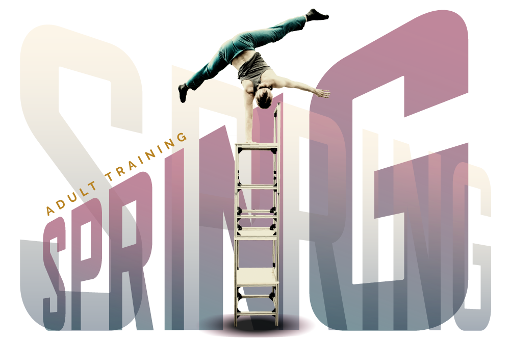
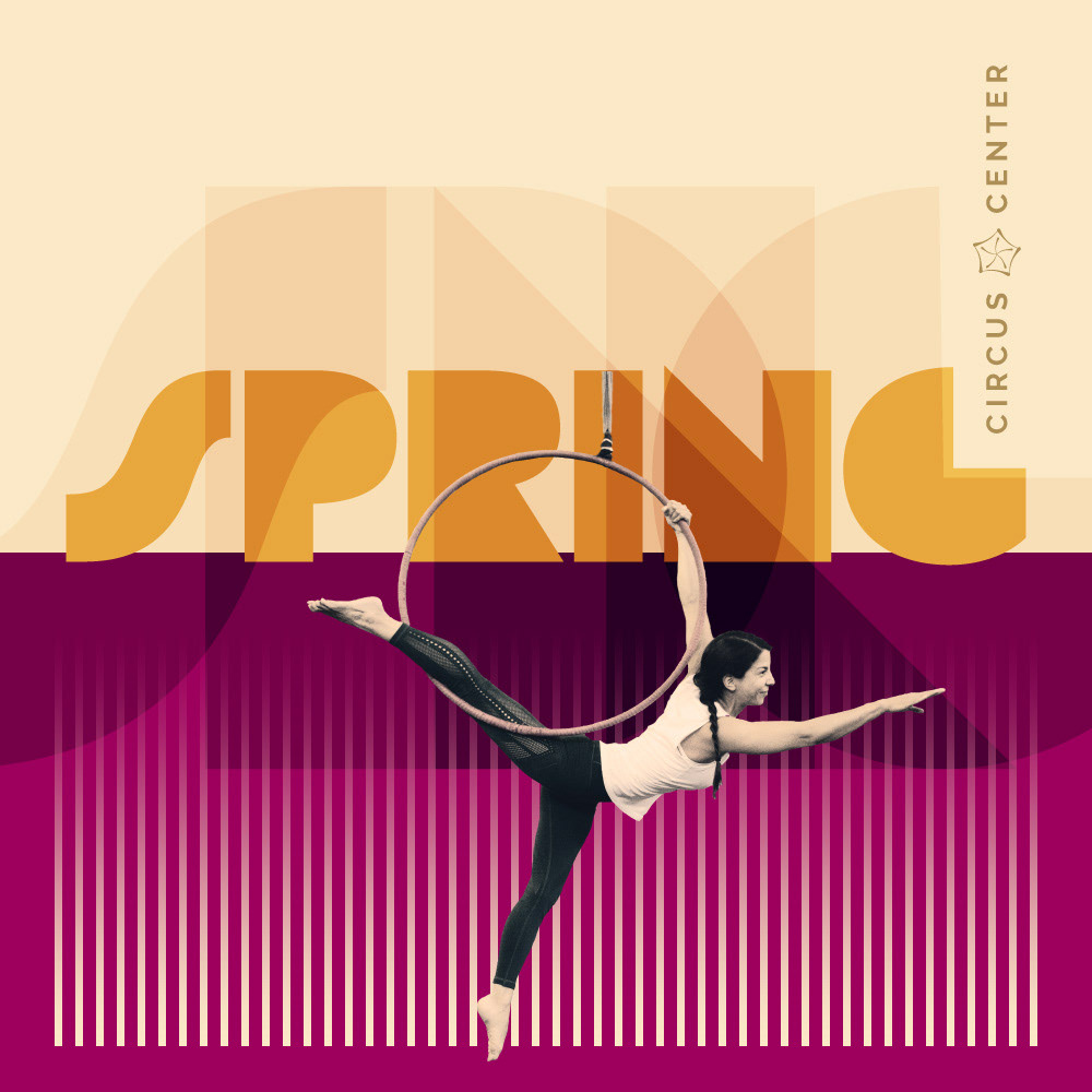
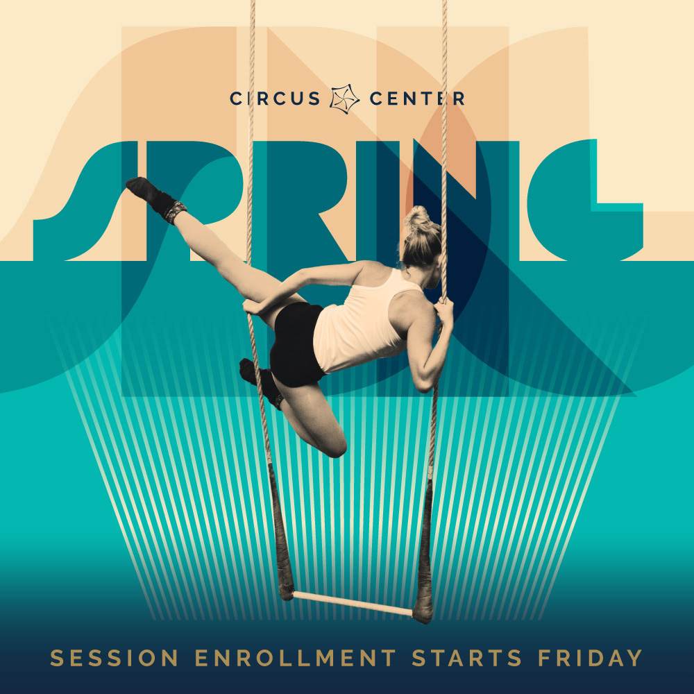
Spring 2024
Social media posts & web assets for adult classes.
PHOTO CREDIT: FERNANDO GAMBARONI


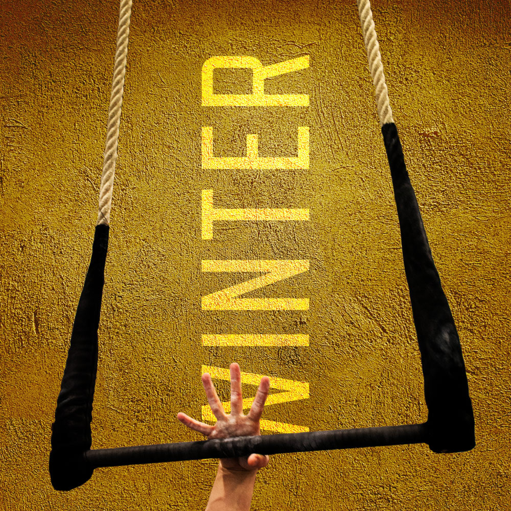
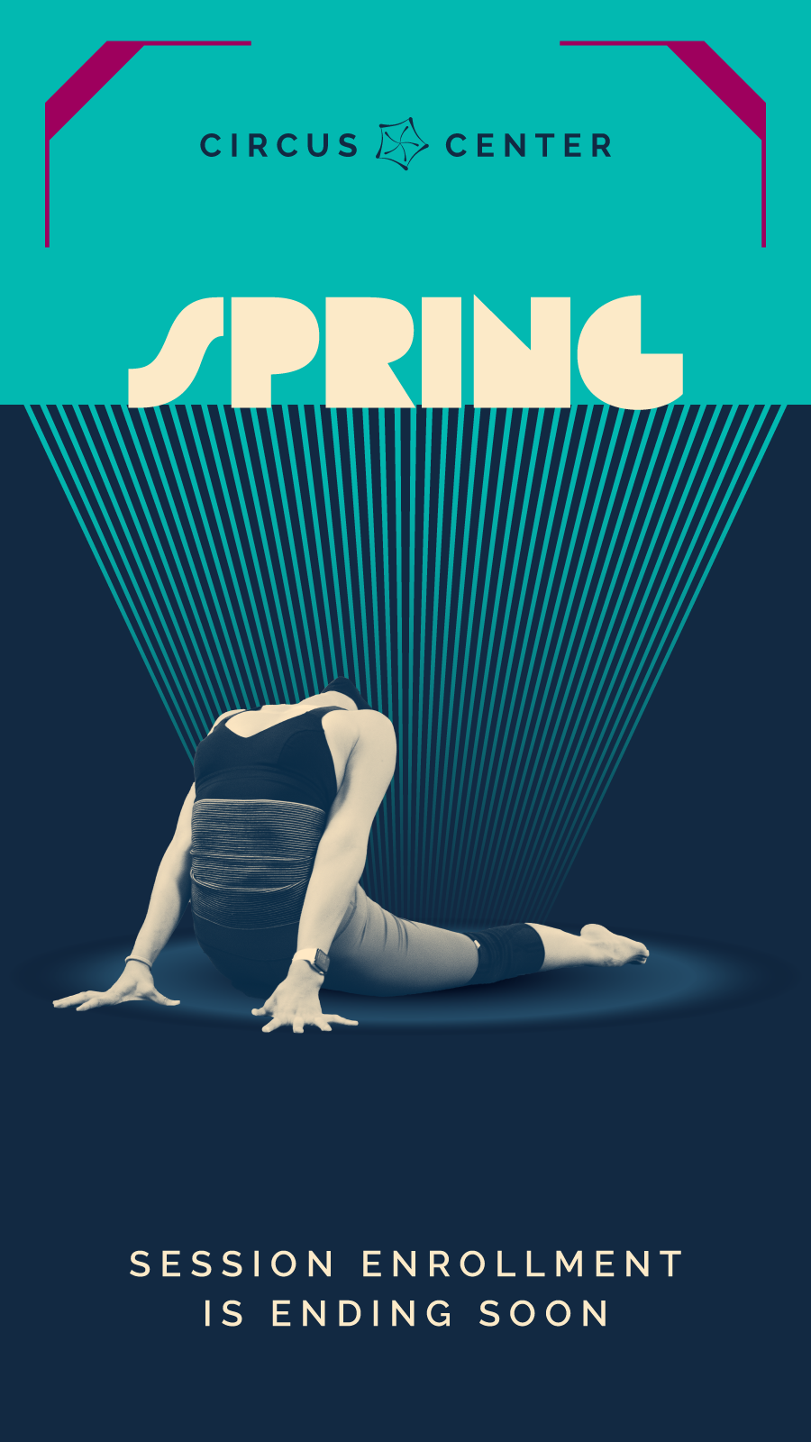
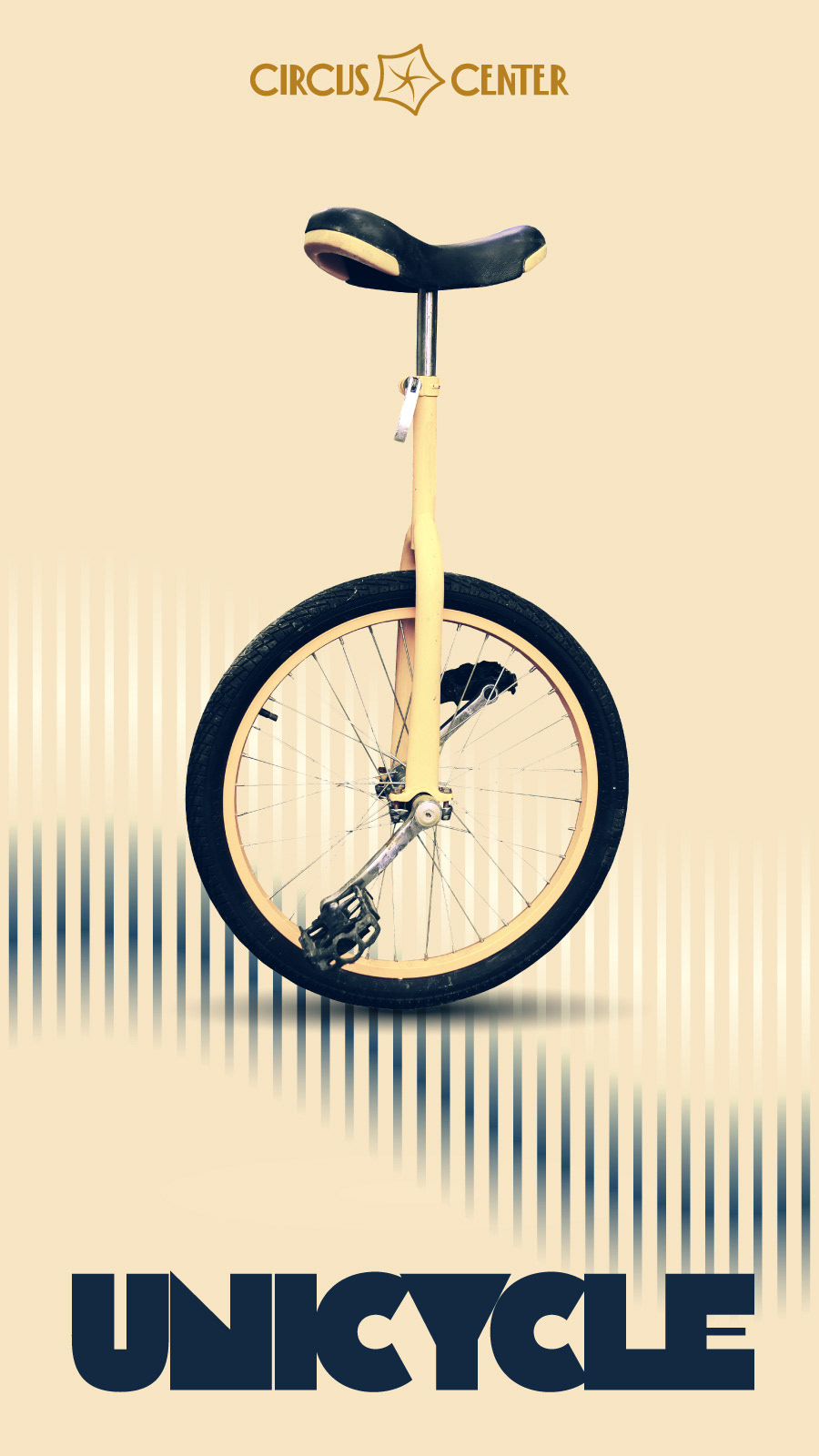
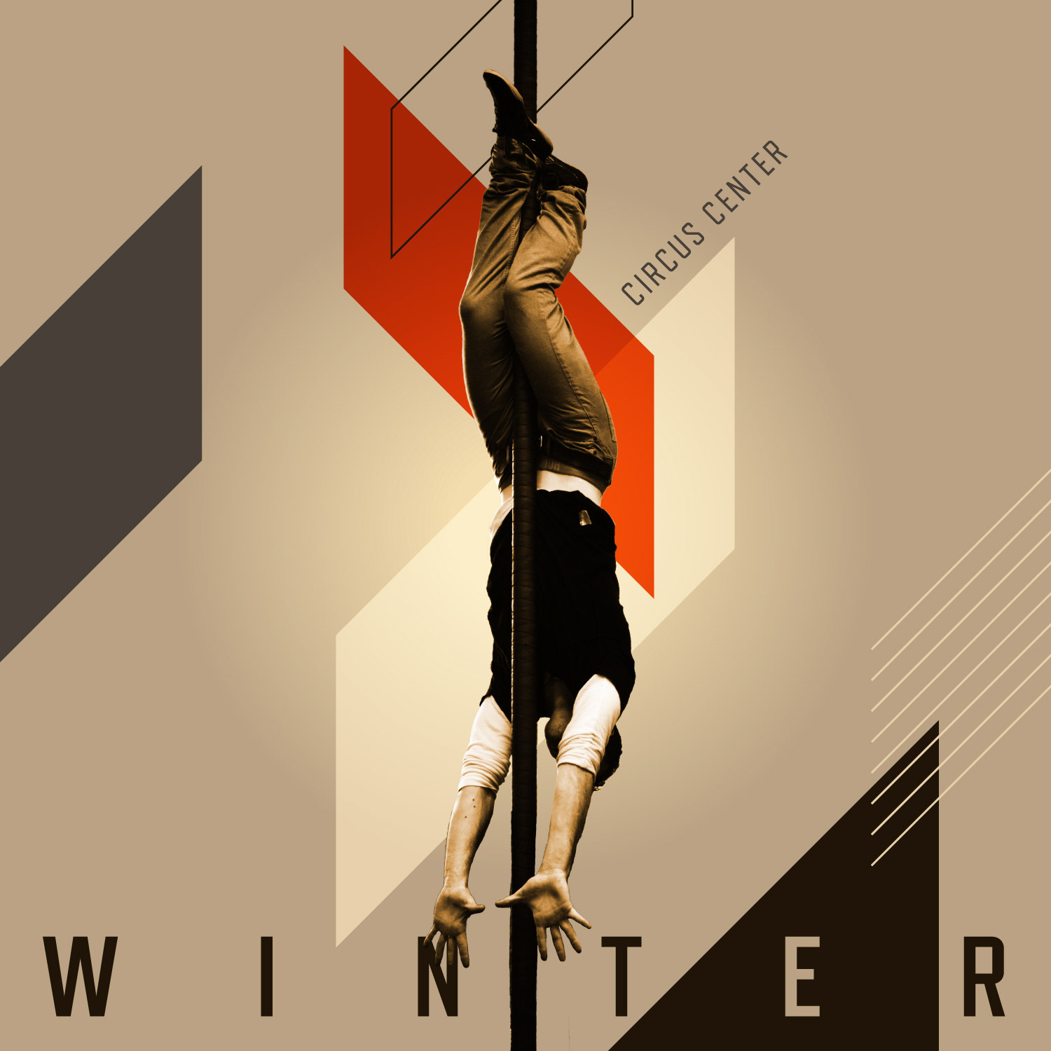
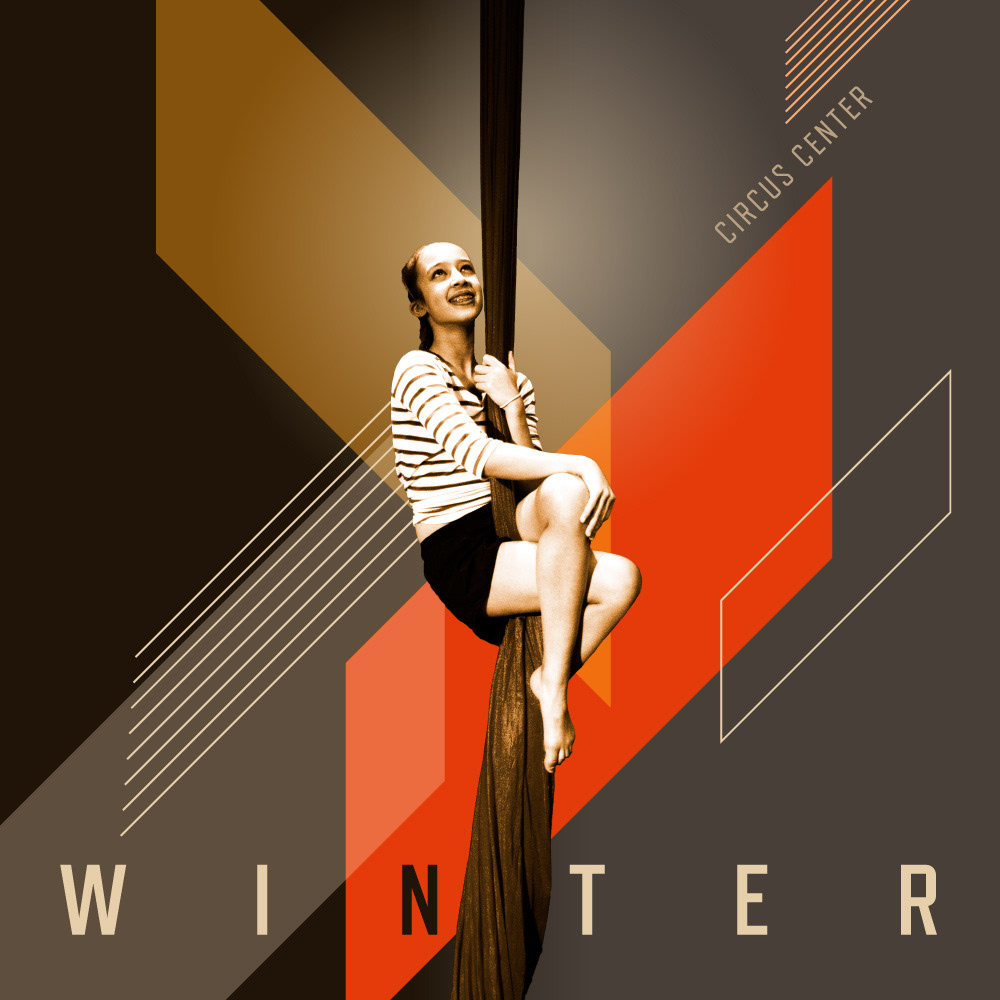
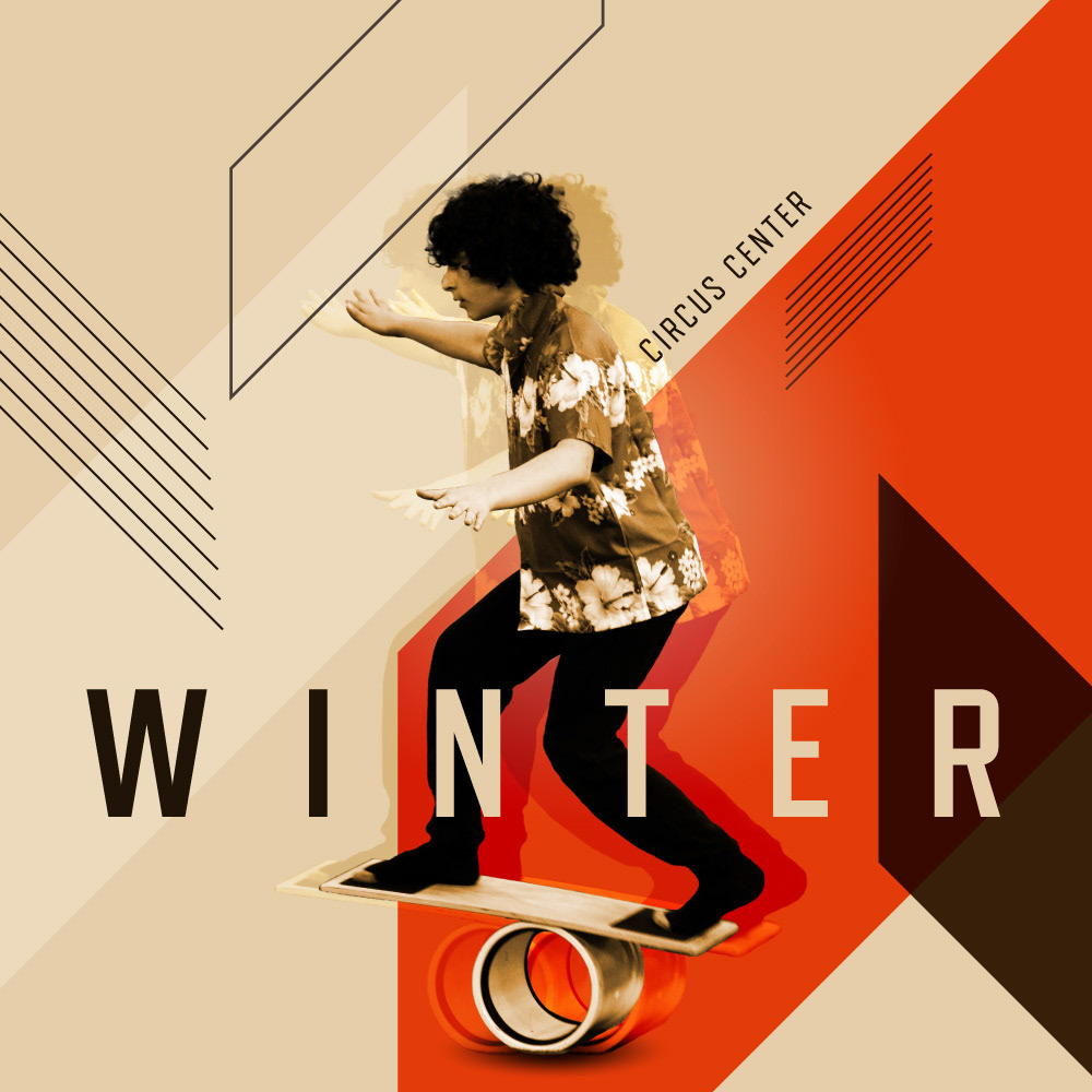
Winter 2024
Over the years, I noticed the special relationship that circus performers have with their apparatus. On the one hand, it's a representation of a challenge they need to conquer; and on the other, it's the development of a physical bond that transforms their apparatus into an extension of their own body.
PHOTO CREDIT: FERNANDO GAMBARONI

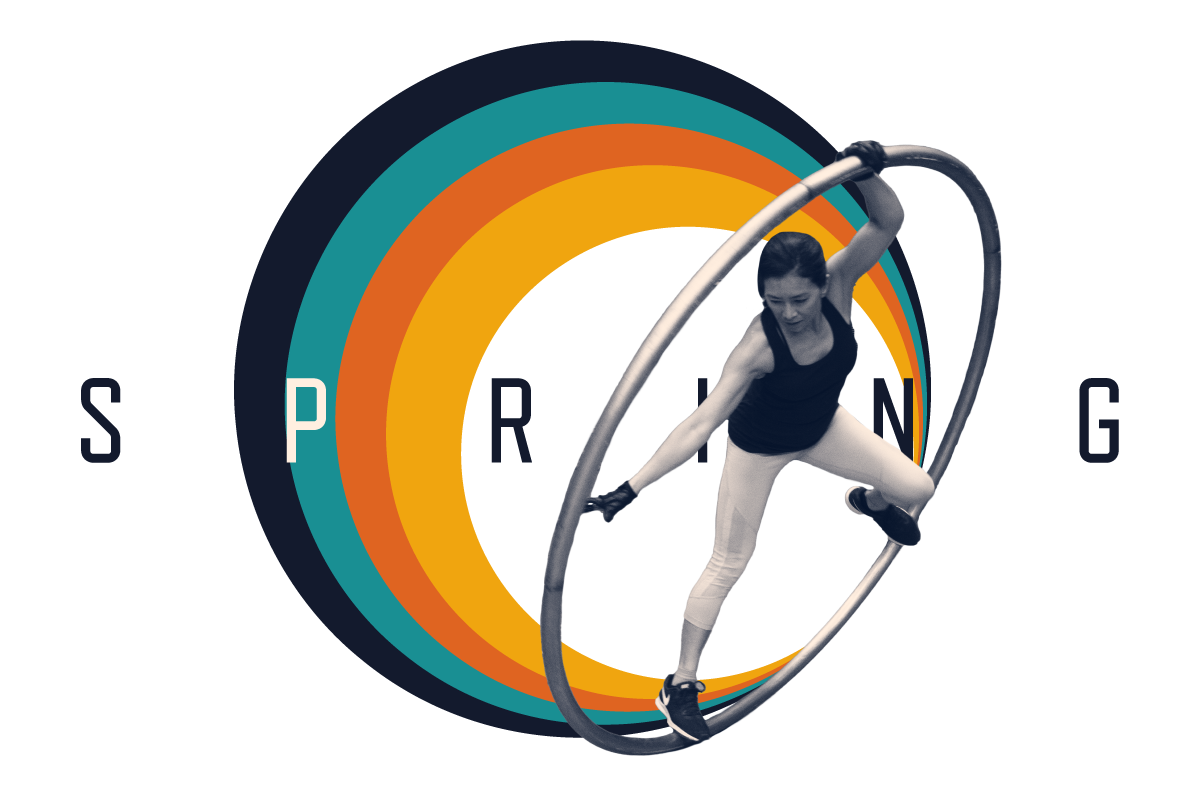
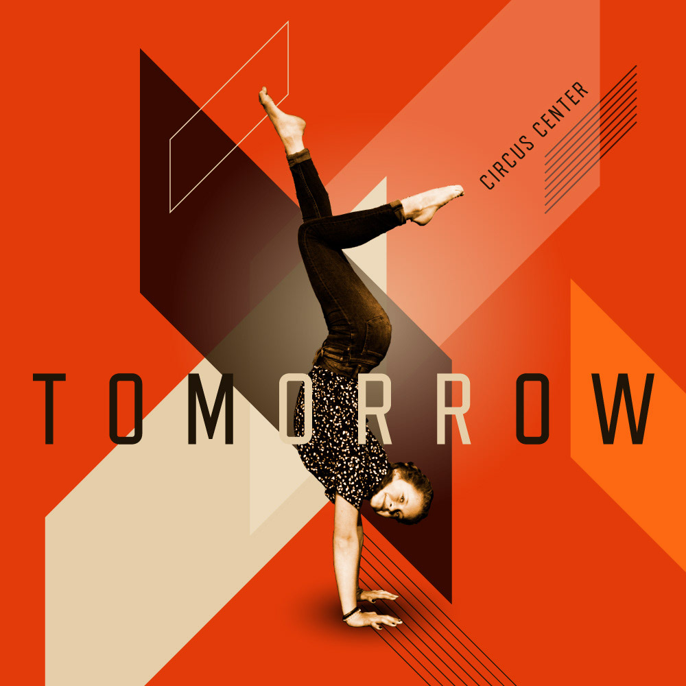
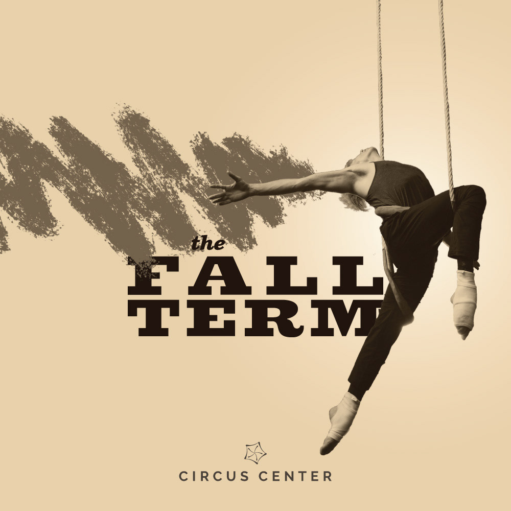
Fall 2023
A selection of posts for our youth social media campaign. This time we also worked with ASYMM digital, a digital marketing agency, so I also created a variety of designs in several ratios for a more comprehensive Google Ads campaign.
PHOTO CREDIT: FERNANDO GAMBARONI
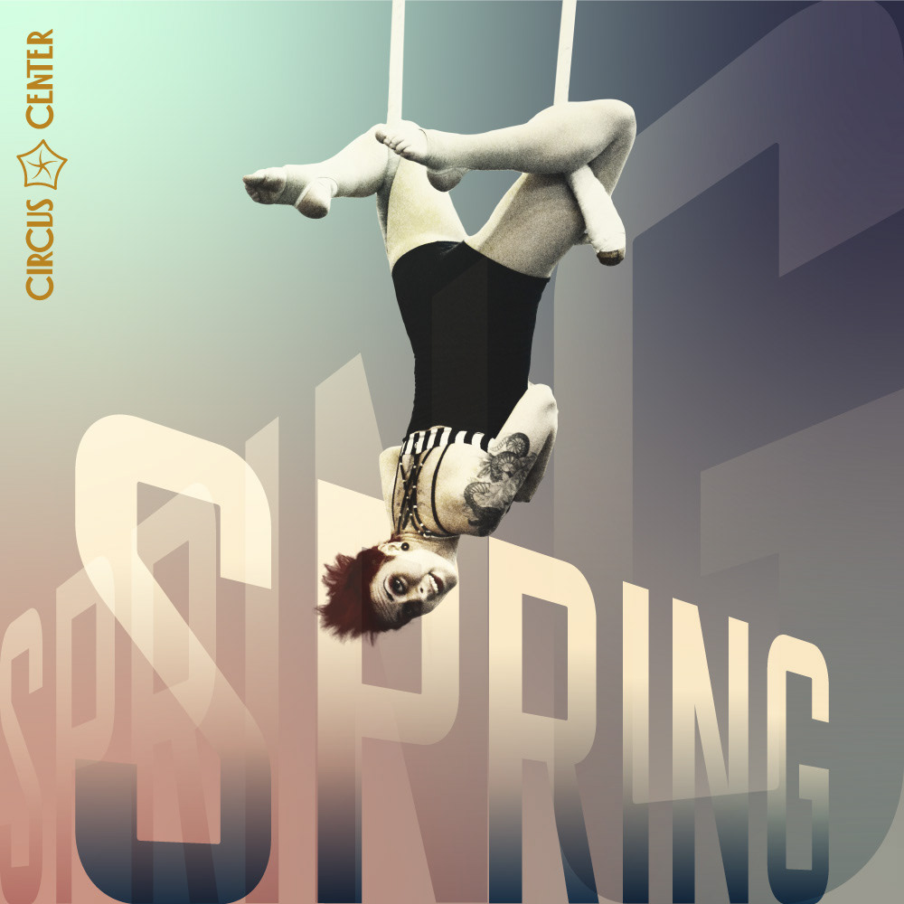
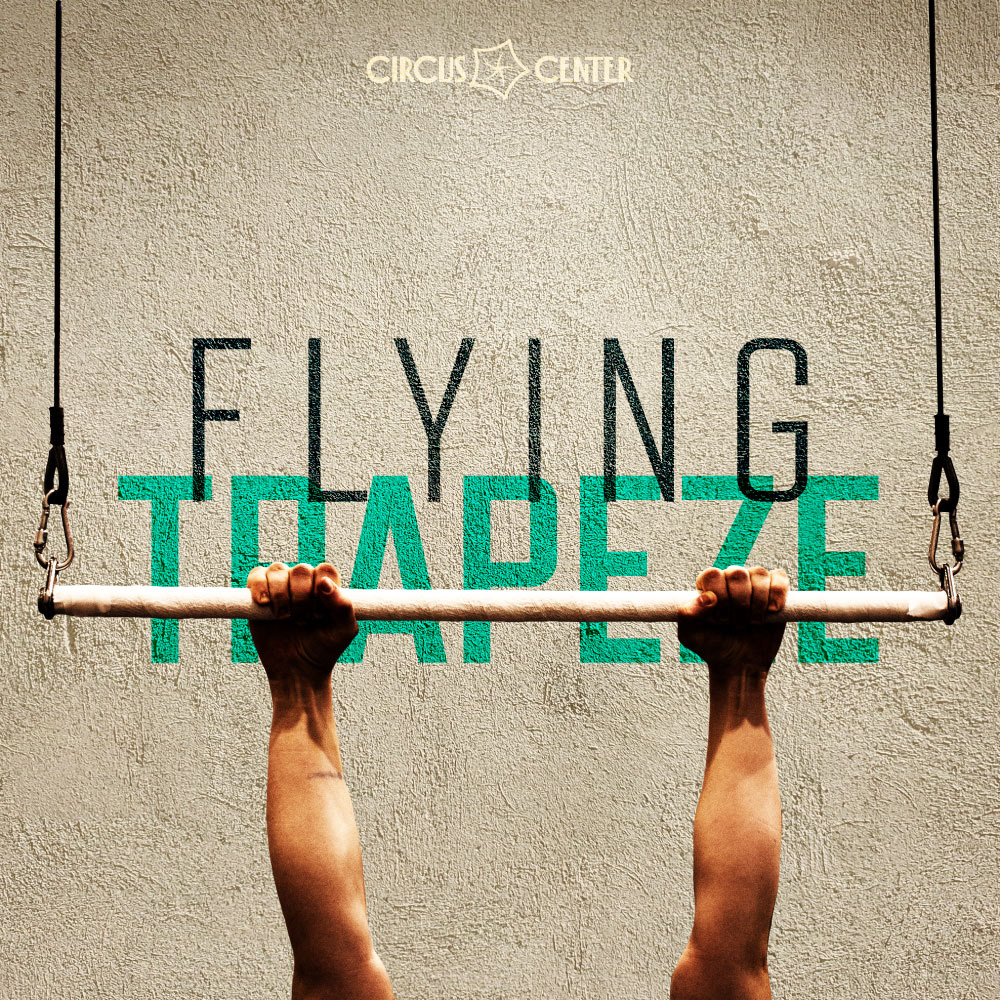
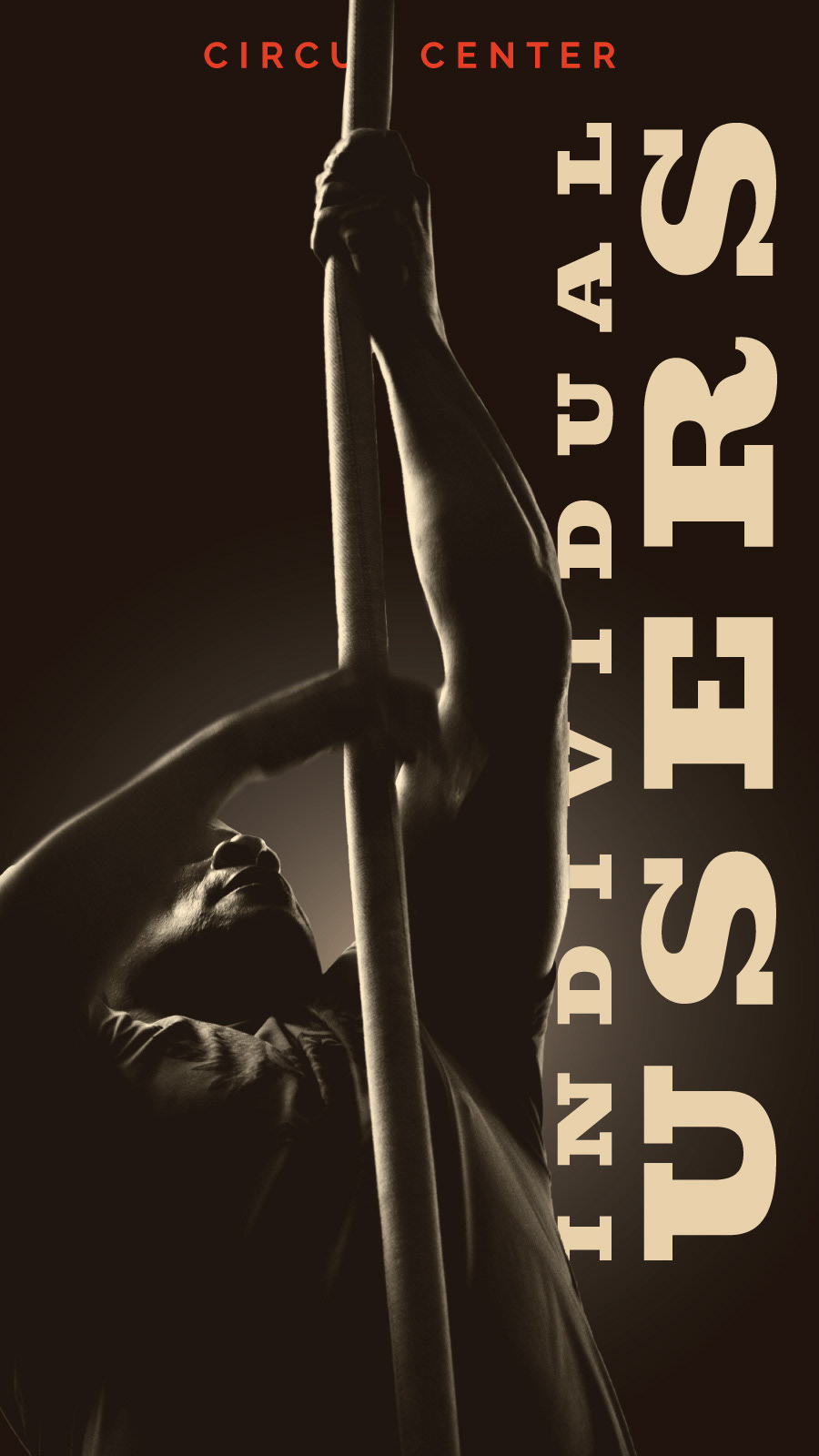
Spring & Fall 2023
Web assets and social media posts for our adult classes.
PHOTO CREDIT: FERNANDO GAMBARONI

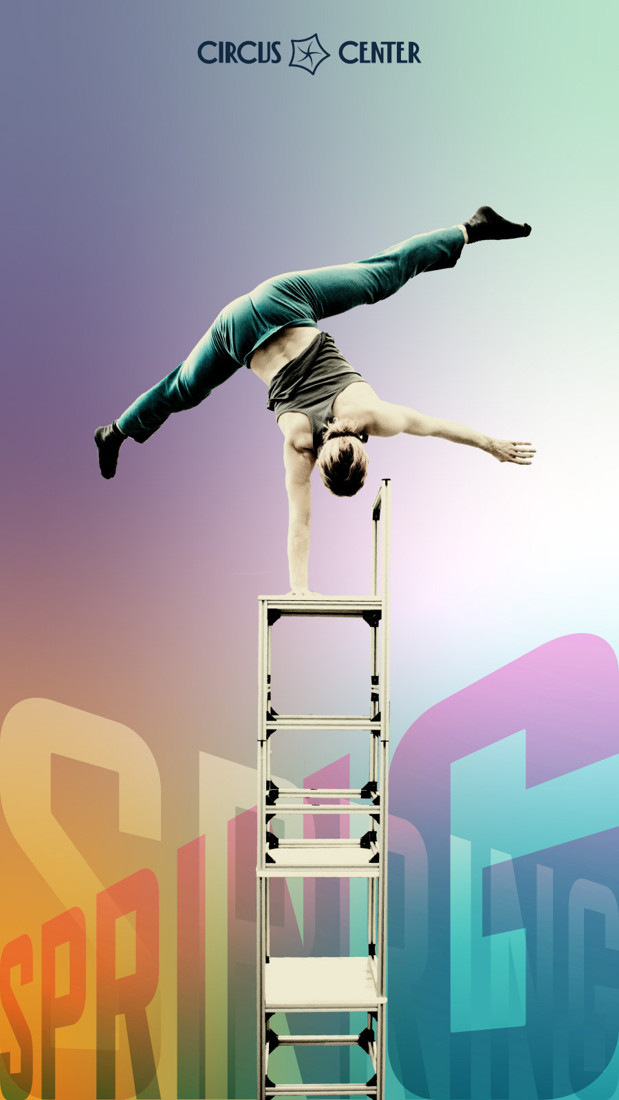
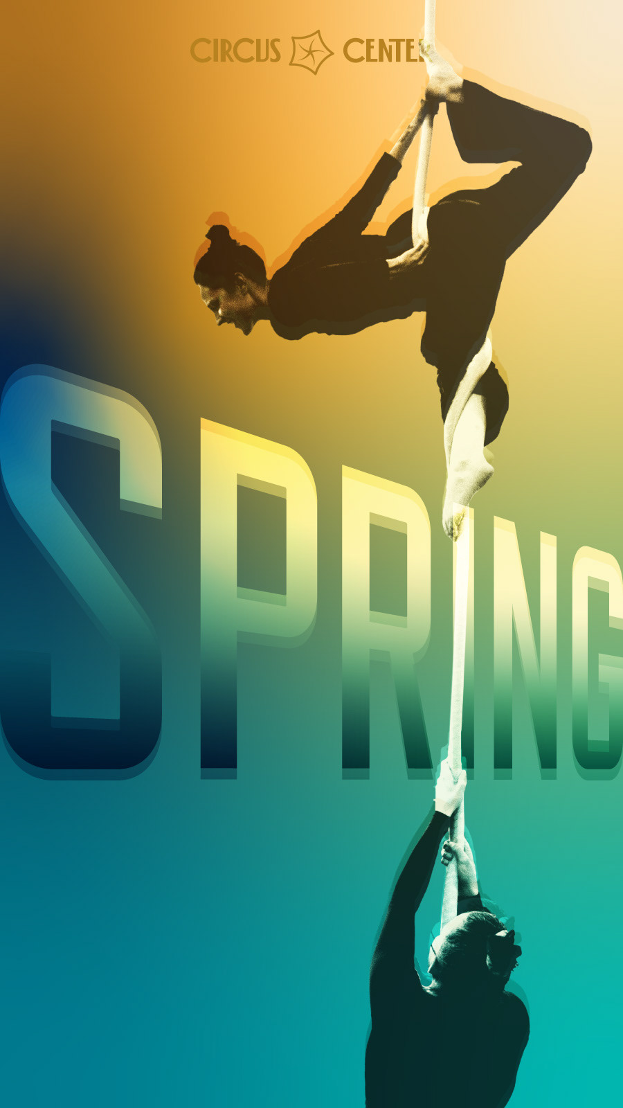
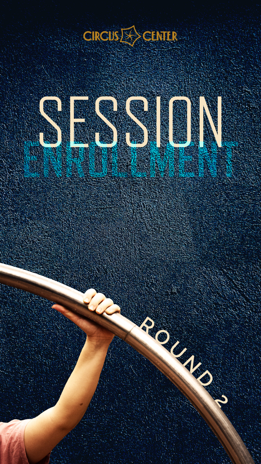
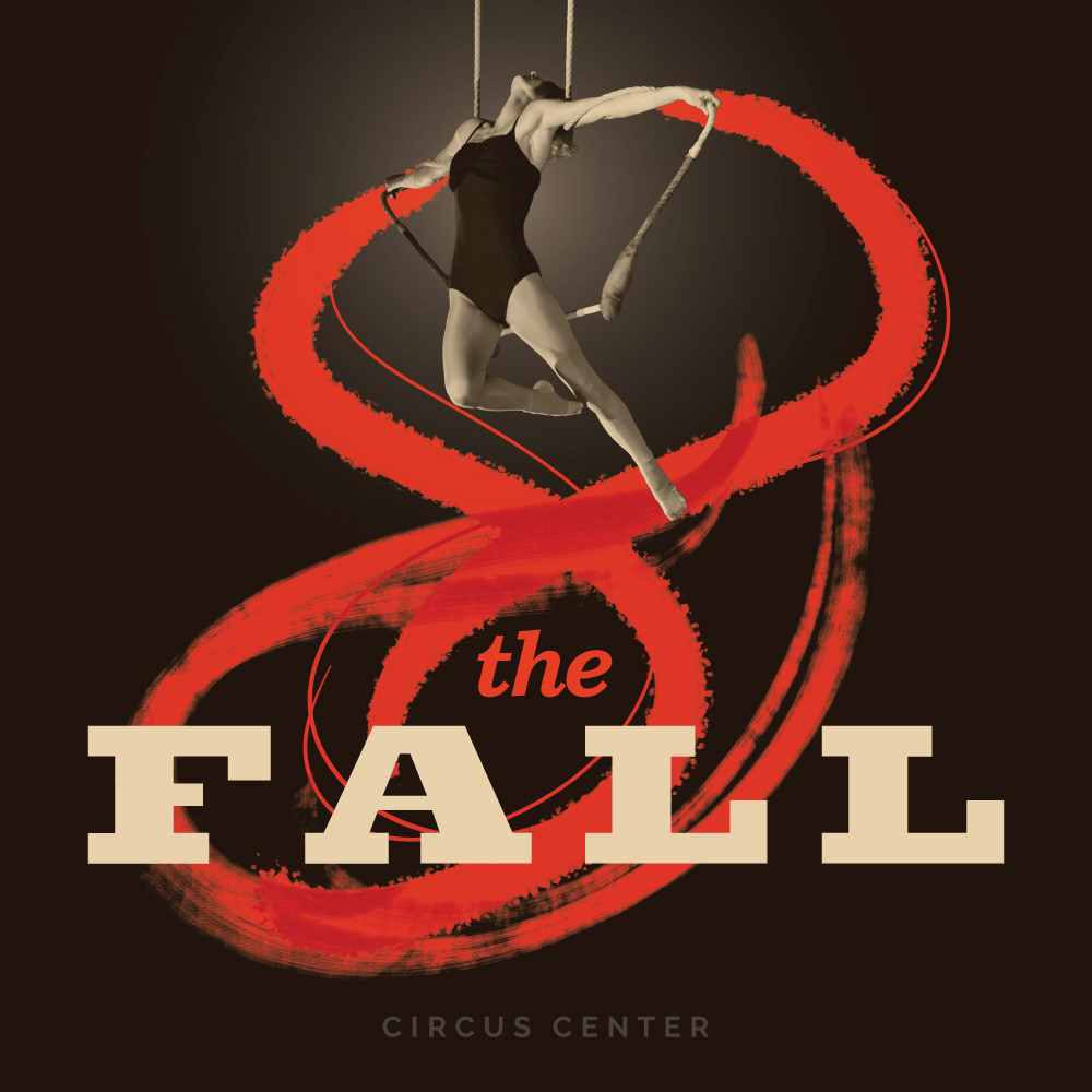
Spring & Summer 2022
Website assets & social media ads for our adult classes.
PHOTO CREDIT: FERNANDO GAMBARONI

Fall 2021 & Winter 2022
Social media campaign and website assets for adult & youth classes.
PHOTO CREDIT: FERNANDO GAMBARONI

Summer 2021
Some social media posts for our adult classes.
PHOTO CREDIT: FERNANDO GAMBARONI