Baylands Frontrunners
Baylands Frontrunners, an LGBTG+ running club located here in the Bay Area, was looking to update their t-shirts..
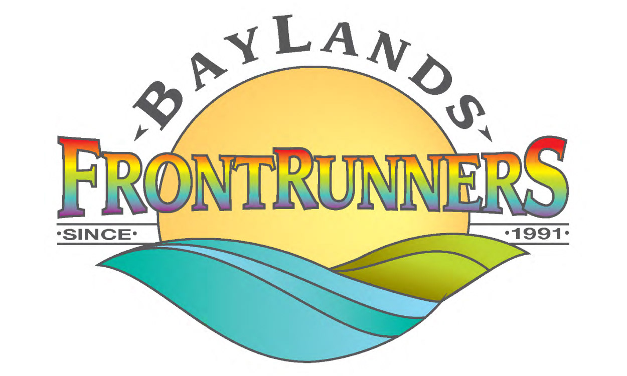
The original logo
Their logo posed a few challenges. Aside from looking a bit outdated, the gradients, the small details, and the complexity of its design would likely not translate well on clothing - and it would increase their printing costs substantially.
So we decided to work on two ideas: the first was update the logo and make it friendlier for clothing in the process; the second was to come up with newer, more contemporary designs.
A cleaner, simplified version
The logo now features cleaner lines, fewer details, and can be printed using a single color. However, it's still perfectly recognizable by anyone familiar with the previous version. While there are adjustments to the font, I tried to keep the 80s, California vibe of the original as much as possible.


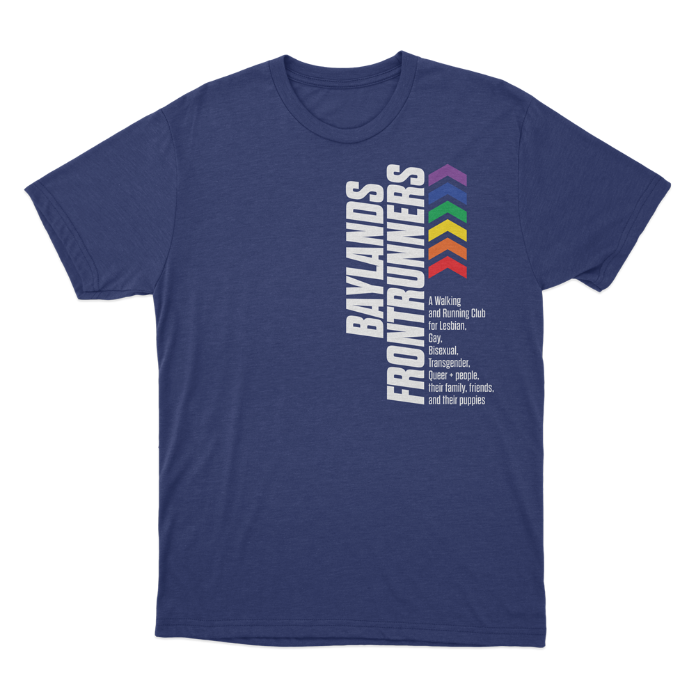
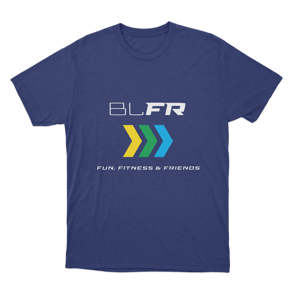
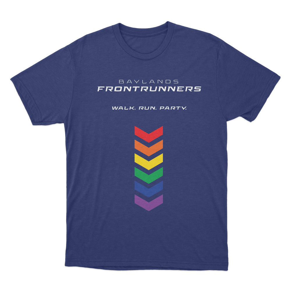
New designs
These are the new designs we proposed as an alternative. More information would be included, like a tagline, or a complete description of what the club is all about. The colors in the original logo would still be there, either as the original reference to the rainbow flag, or as the three colors, representing, the sun, the earth, and the sky.
And the bottom right design is a bit cheeky. Yes.
My suggestion was to print the new version of their legacy logo on the back. No extra colors would be needed, keeping the additional cost of printing it to a minimum.

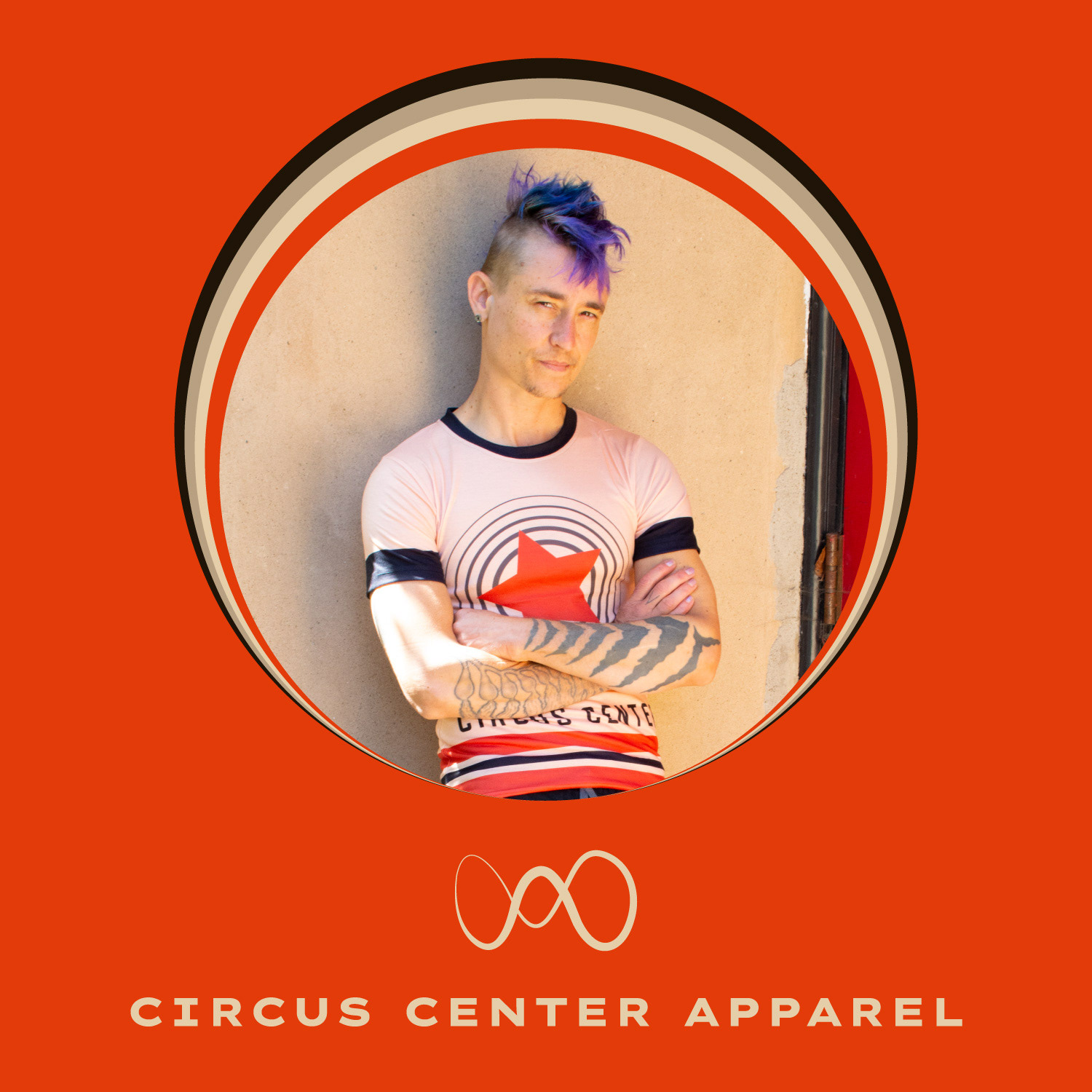
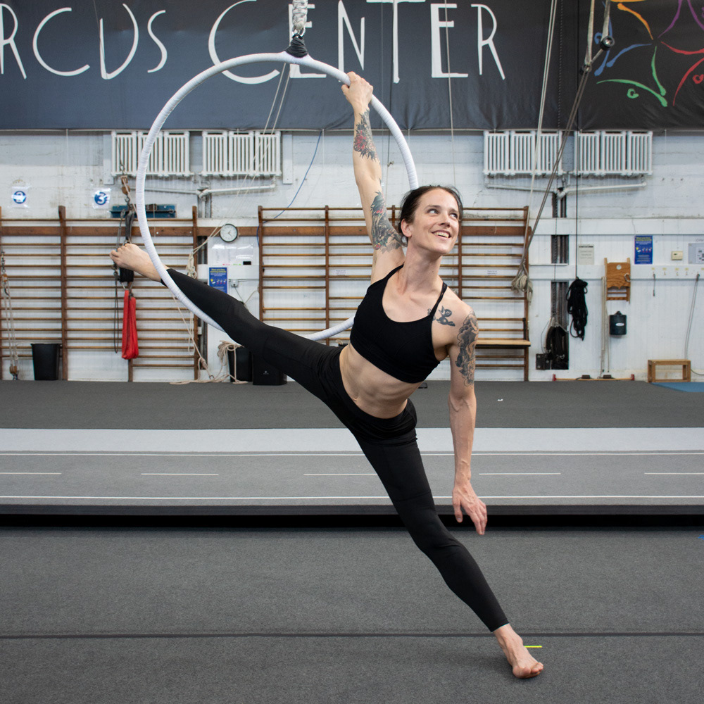
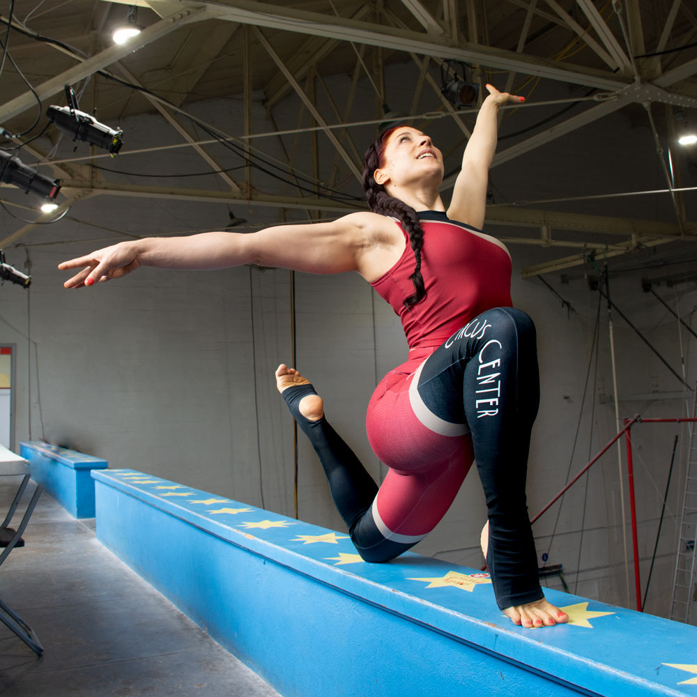
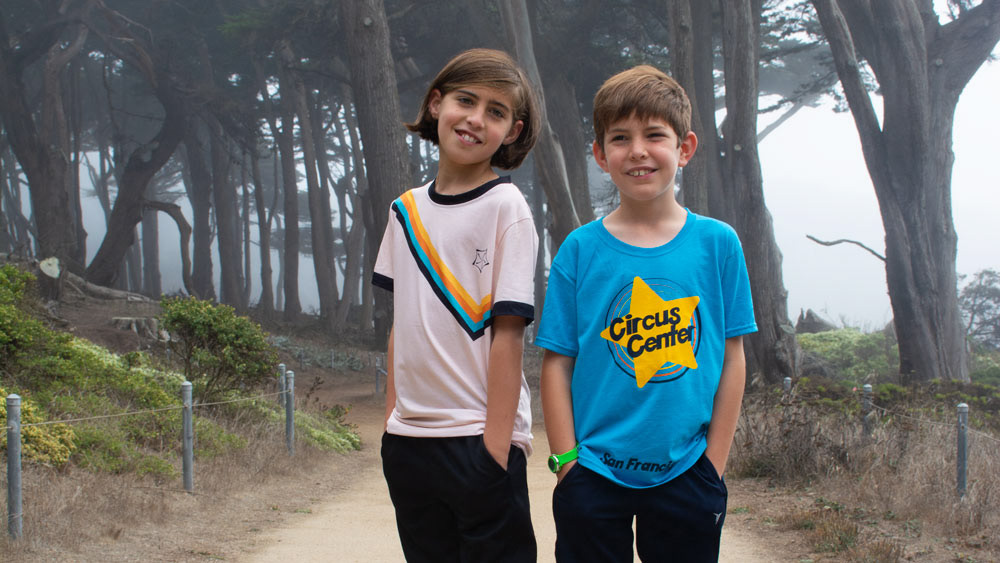
Circus Center Apparel
In March of 2021 I was asked to revamp Circus Center's merch. I enlisted the help of the great Sarah Hail, and together we relaunched our clothing line in early 2022. Sarah was in charge of the production and point of sale, while I was in charge of overseeing the project and the designs. However, no designs were finalized without her feedback and input, so this was very much a collaboration.
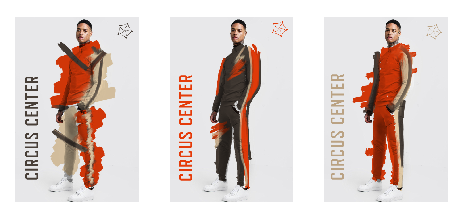
We decided to work on a clothing line specifically designed for training, as well as a few leisure options, because our students liked to wear our clothing regularly - not just for training.
Using her own training experience, Sarah also approached a few teachers to get input as to what features our training clothes should have.
Based on our budget and all the information she collected, we decided to create 3 clothing lines.
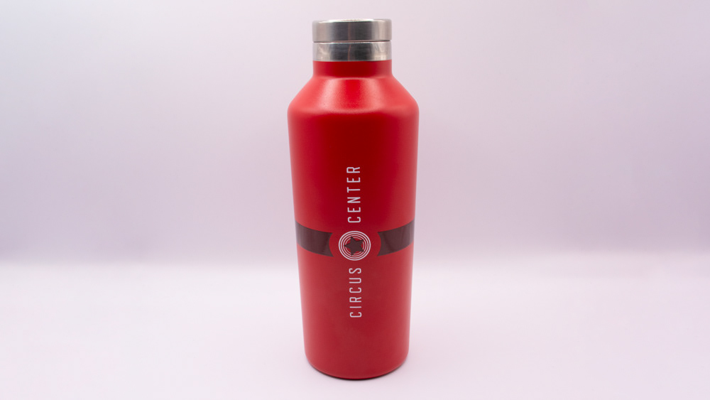
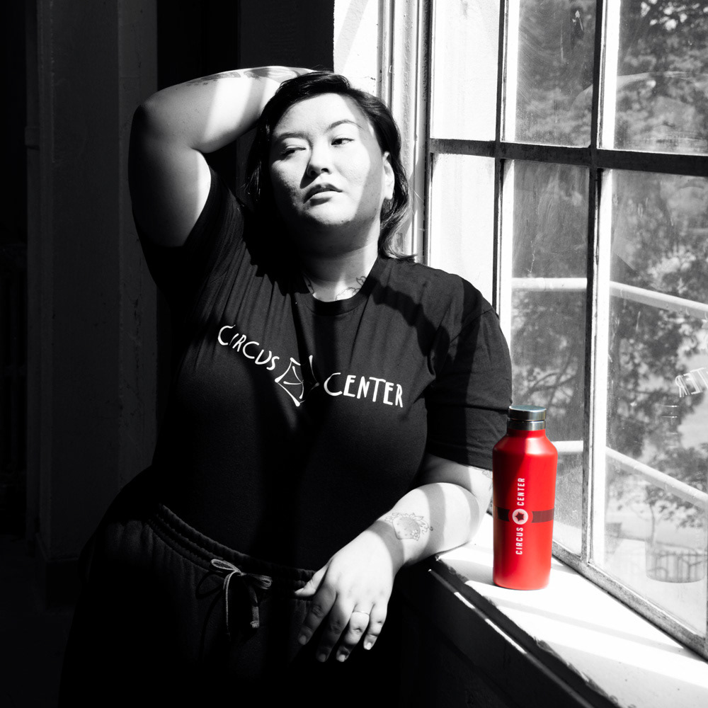
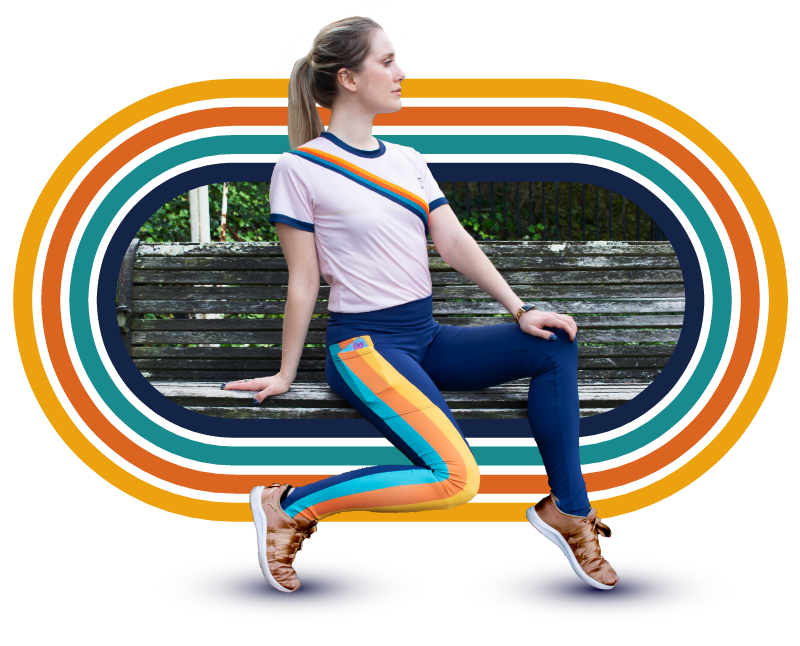
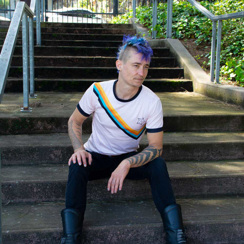
PHOTO CREDIT: FERNANDO GAMBARONI


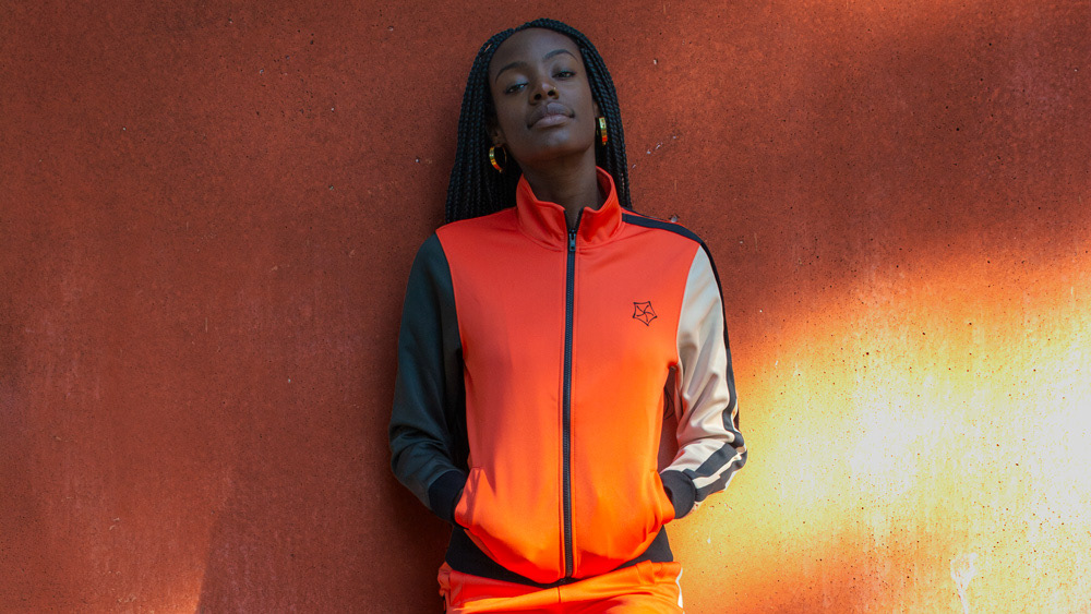
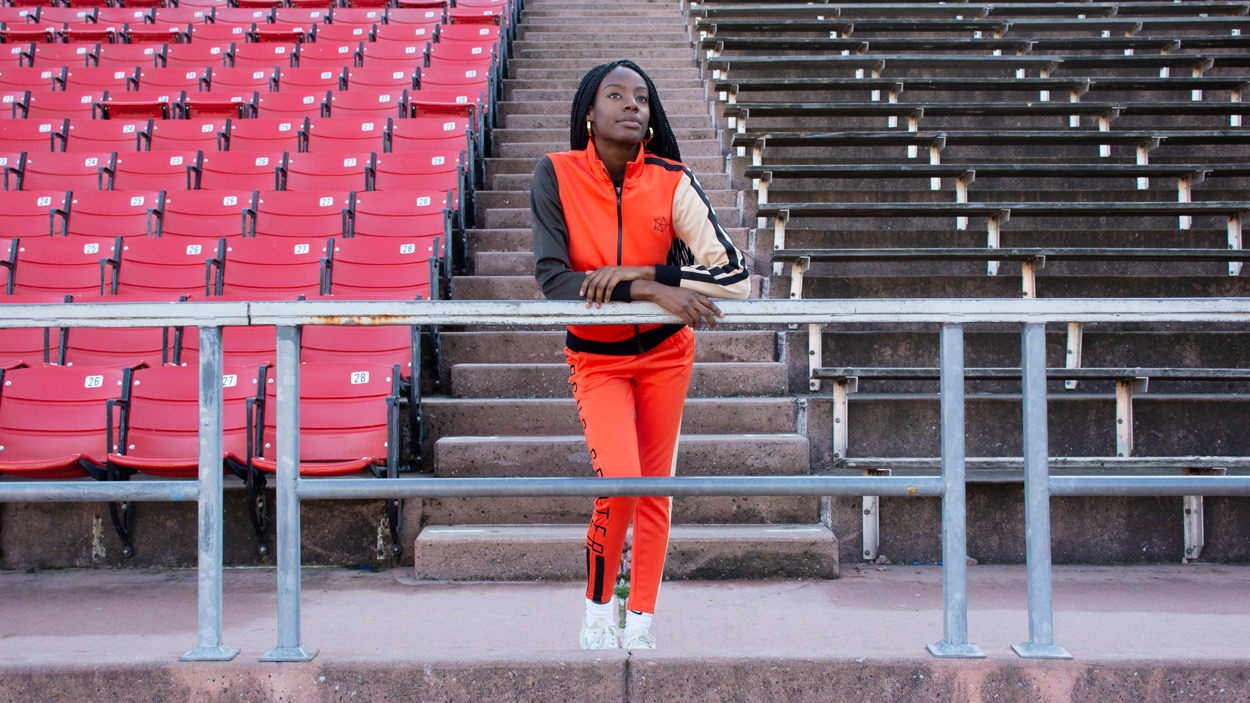
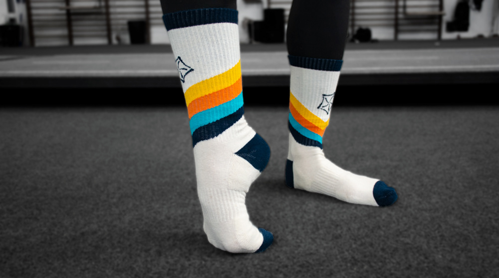
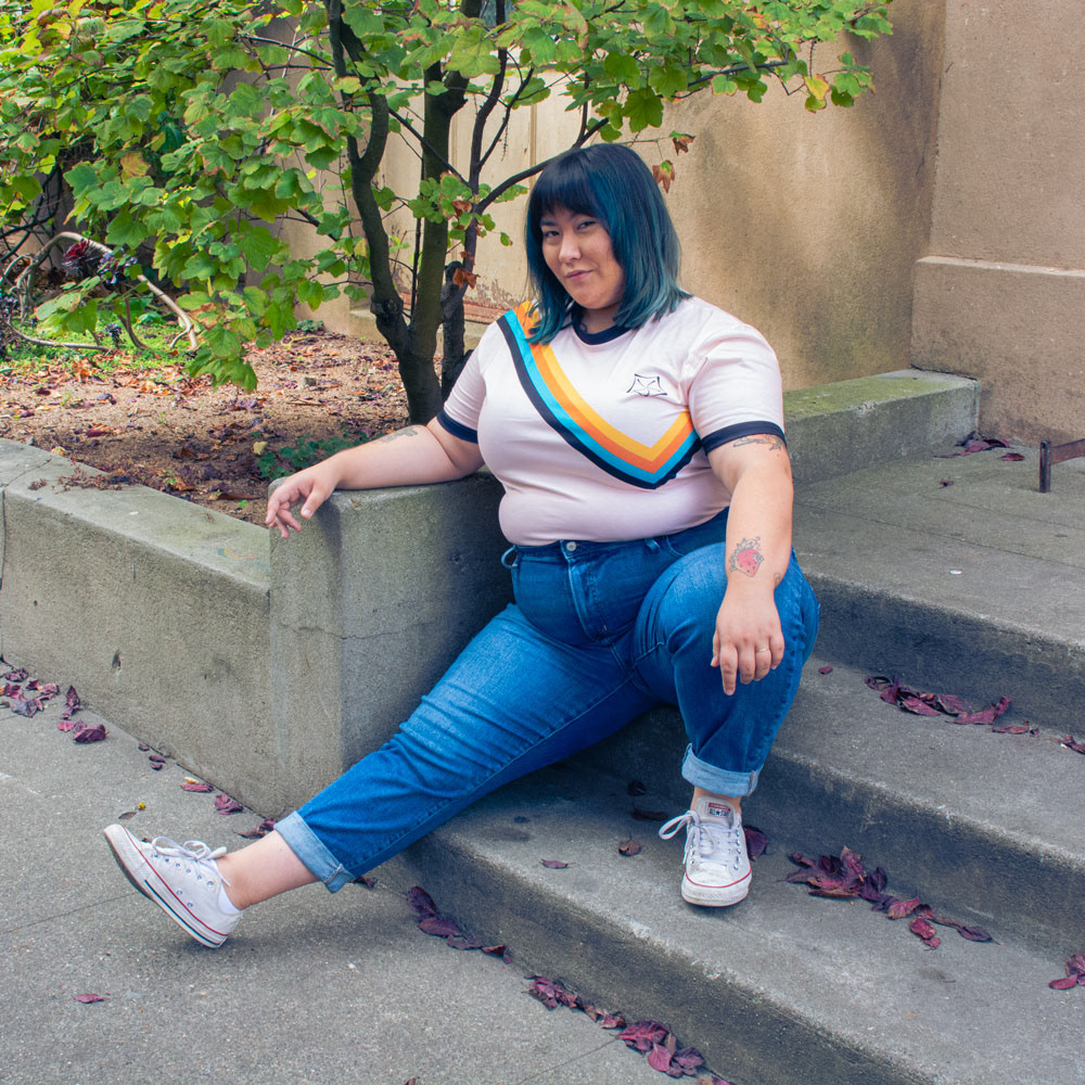
The Retro Line
The Retro Line harkens back to a different time in San Francisco: back to the 70s, when the Pickle Family Circus got started.


The Vintage Line
The whole purpose of the Vintage Line was to stand out, just like a circus artist should. The idea was to have a design that would go back in time - and look forward. It was based on early 20th century Russian circus designs, considered to be futuristic at the time.