Branding
This is the current project I am working on. Buttonwork is a brand new technology services company. It is my first time working on a project of this nature. And while I did dive into the design styles of the technology world, I am also bringing my artistic background into the mix as well.
Logo ideas
I created many drafts. The thing that was missing from most of these was a nod to technology. The clear winner ended up being the bottom right design, showcasing a transition from tangible to digital, while also turning ideas into reality.
When I finished working on the middle top option, I said to myself: 'if I had known a 90s acid jazz band with this name back then, this logo would have been killer.'


Negative space!!!


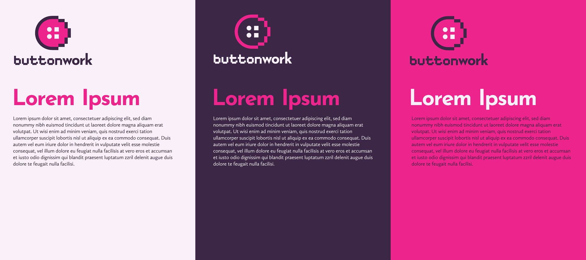
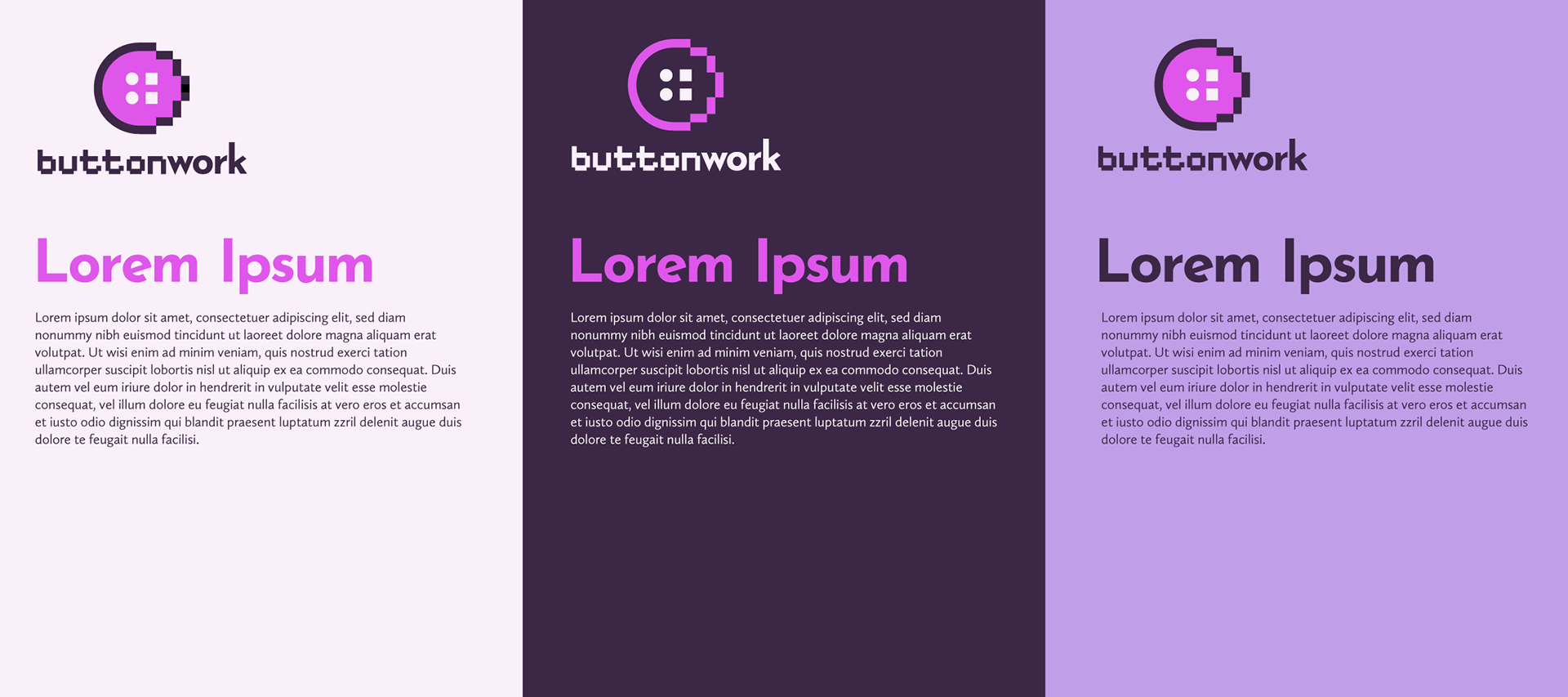
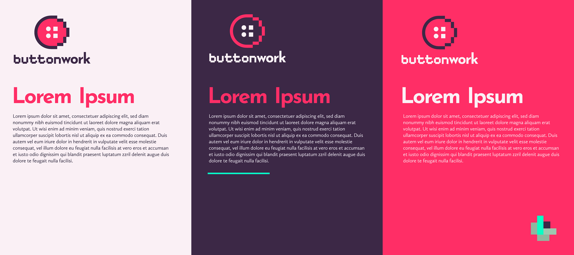
Colors
The idea was to have a color palette that would work within a technological context, but that would also express a certain degree of warmth and most importantly: joy.
I thought it would be challenging, but thinking that these ideas are opposed is a preconceived notion. At first, I thought we should do what many technology companies have done, which is to have their identity be defined by a single color, but that didn't work for the juxtaposition elements we were looking for, and a company that is certainly not straight-laced.


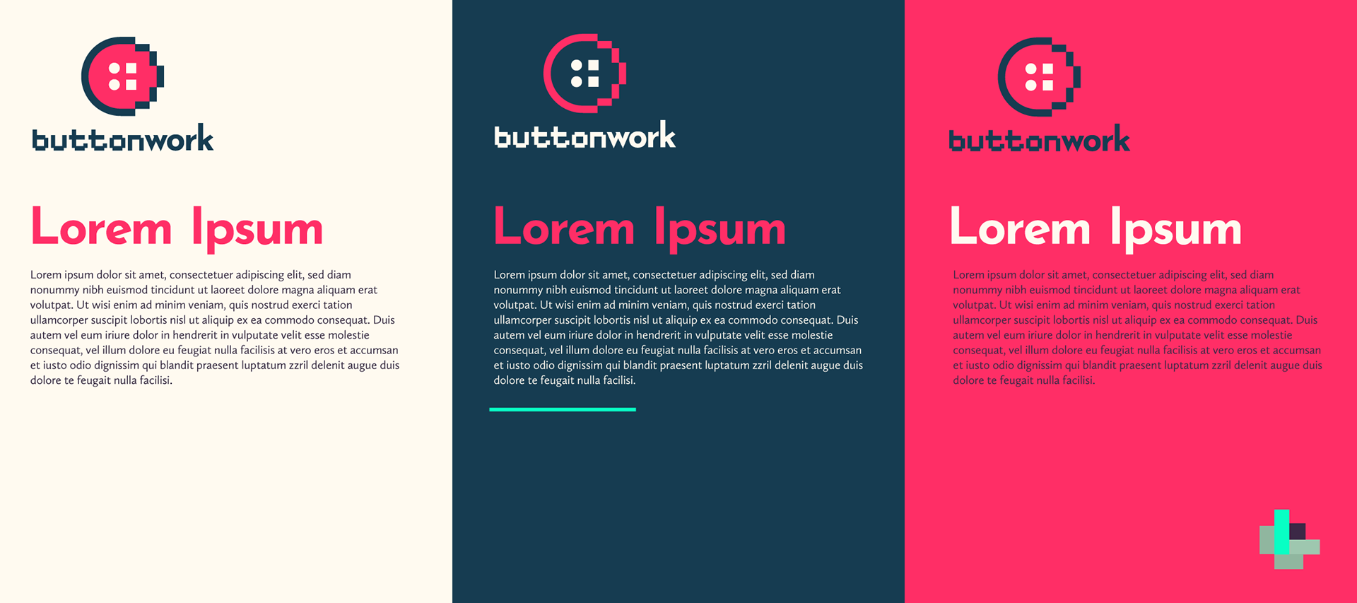
The winner
Technical, yet fun.


Updates coming soon...